Scalable Redesign for Web & Mobile SaaS Platform

Understanding the Challenge

The legacy experience had inconsistent patterns, dense screens, and limited accessibility, making it difficult to find and act on key insights. We needed a clear information hierarchy, a reliable component system, and a visual language that worked equally well for data-rich dashboards on desktop and for in-motion use on mobile.
Role
UI Designer
deliverables
Component Library, Dashboard Design, WebApp Redesign, Mobile App Redesign
plataforms
WebApp & Mobile App
tools
Figma, Miro, Google

Overview

This project began with a customized modular dashboard and evolved into a platform-wide redesign across web and mobile. The goal was to reduce complexity, improve accessibility, and create a scalable system that could support data-heavy workflows for different user roles. The result is a unified experience that speeds up decision-making and keeps implementation efficient across teams. The redesign unified web and mobile experiences, reduced workflow friction, and improved clarity for data-driven decision-making across roles.

Understanding the Existing Experience

discover

Briefing the Problem

The platform offered a wealth of data but required significant effort to navigate and interpret. Information was distributed across multiple screens, and the visual design didn’t fully communicate priorities or guide action. The challenge was to transform Tourmo’s analytical power into an experience that was both efficient and human-centered.

Key Insights

• Managers needed immediate access to driver behavior and performance data in a more visual and actionable format. • Drivers required a simplified, accessible interface to complete tasks safely and efficiently. • The overall platform needed stronger visual consistency and scalability across web and mobile. • The experience had to evolve from displaying information to telling a clear, data-driven story. • A unified design approach would allow insights, workflows, and components to scale across multiple products.

Understanding the Current Experience and Its Limitations

While the platform supported a wide range of operational use cases, insight discovery was fragmented. Managers often had to move between reports, lists, and detail pages to understand what required attention. This structure made it difficult to maintain situational awareness or quickly compare trends across drivers, teams, or timeframes, especially in fast paced operational contexts.
No items found.

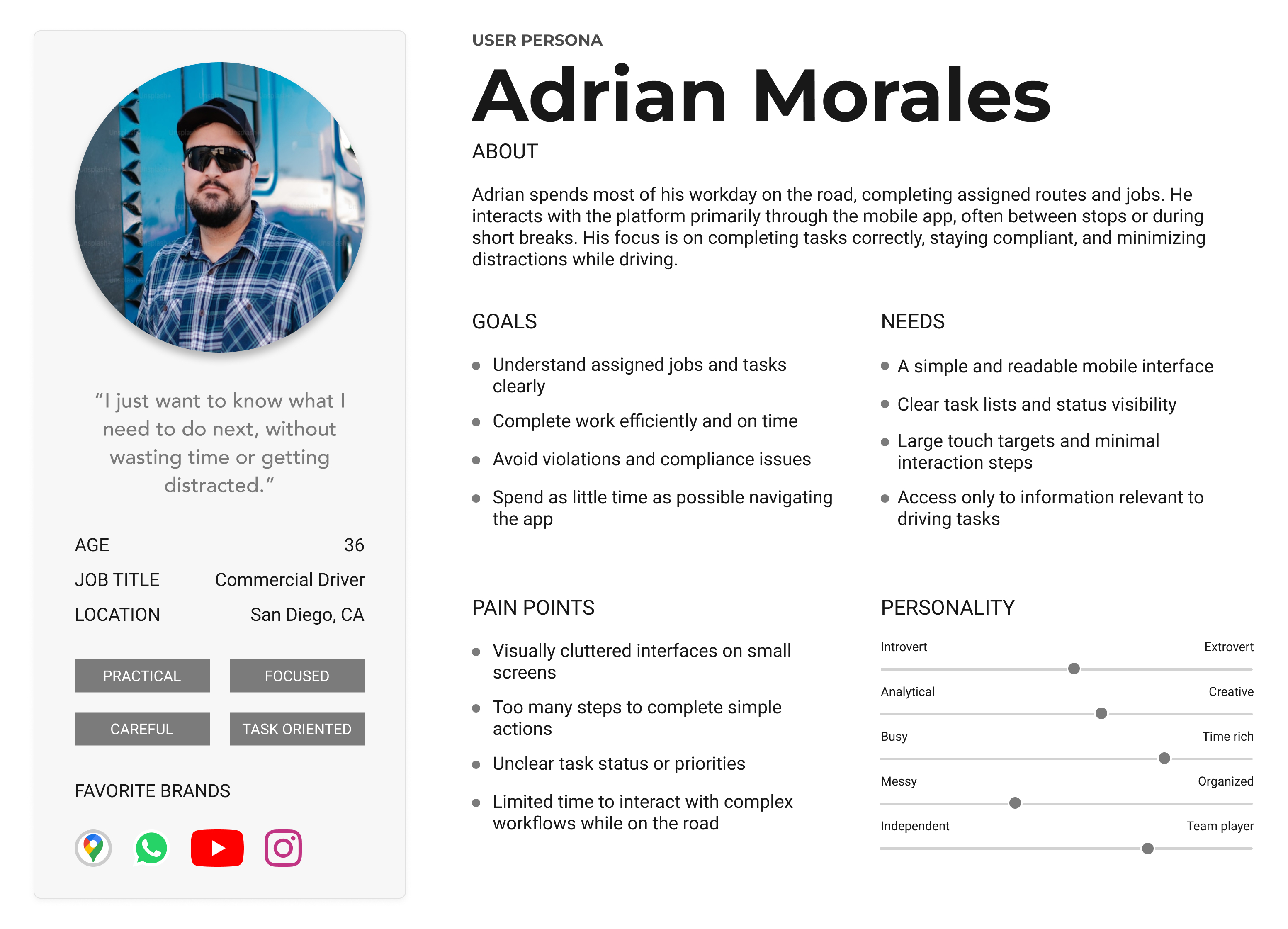
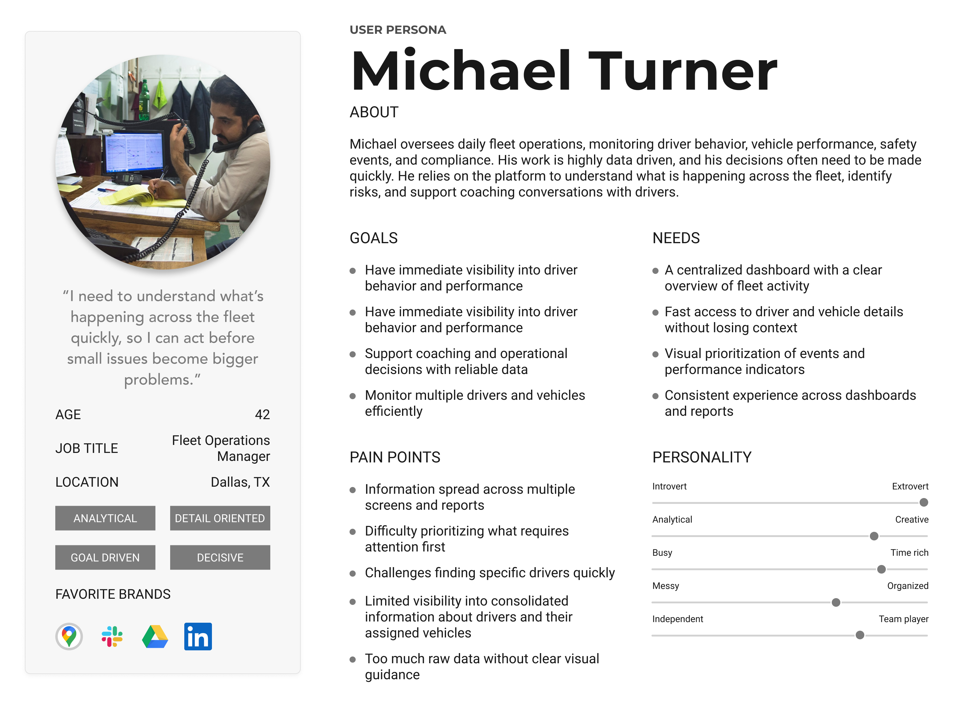
Understanding Our Users

The platform serves two primary audiences with distinct usage contexts. Managers interact with the product throughout the day, monitoring performance, identifying risks, and supporting coaching decisions. Drivers engage with the system primarily through the mobile app while on active routes, where speed, clarity, and minimal distraction are critical. In some cases, users switch between managerial and driving roles depending on the task, reinforcing the need for a consistent experience across web and mobile. To ground decisions in real usage contexts, I defined two primary user types: Managers and Drivers.
No items found.

Defining a More Visual, Connected Experience
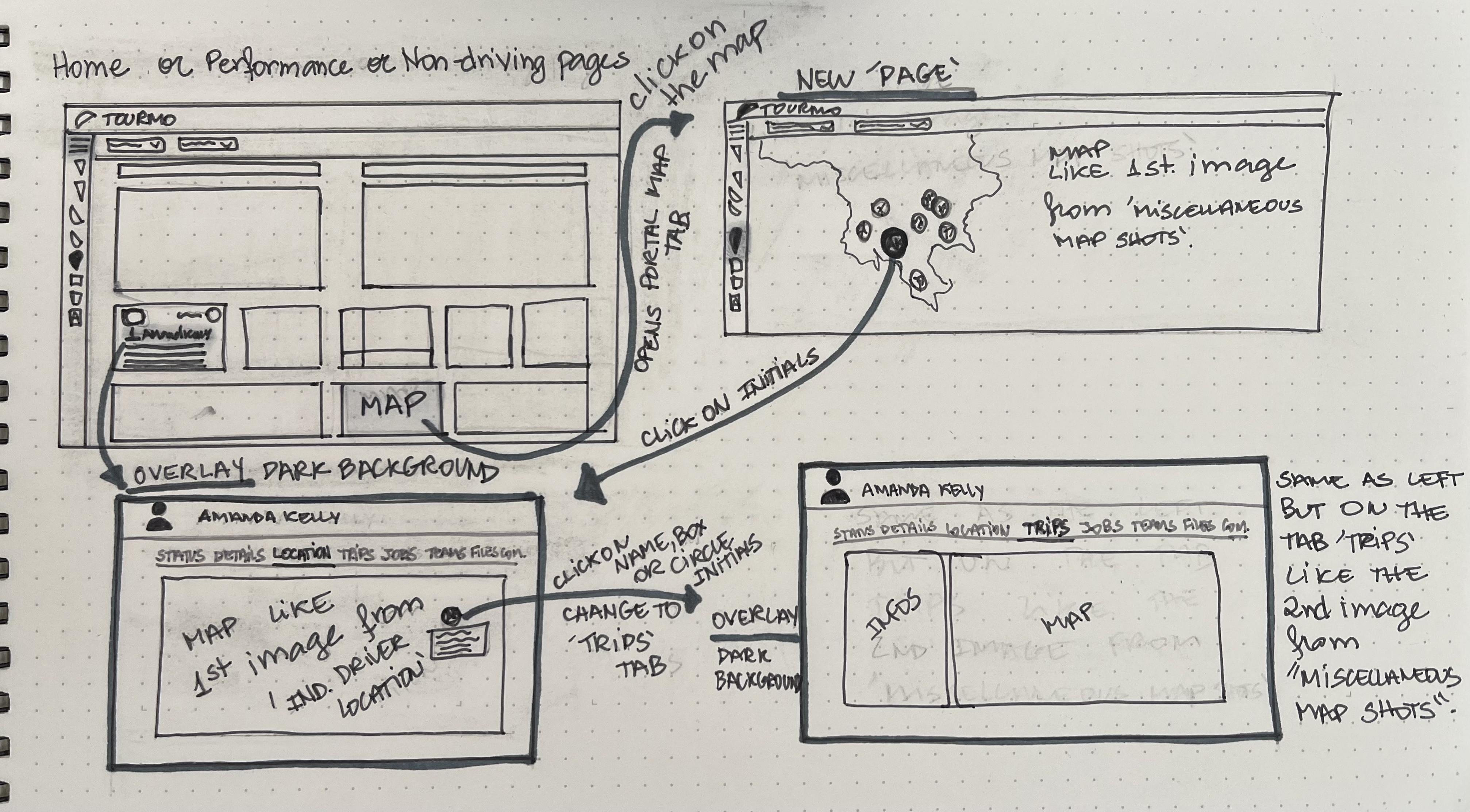
From the outset, stakeholders had a clear vision for a centralized dashboard that could surface critical information more effectively. The discovery phase helped clarify how this dashboard should function within the existing platform, identifying which insights needed to be visible at a glance and how they could support faster decision making. The dashboard was defined as a central entry point for managers, organizing existing data in a more visual and actionable way and setting a foundation for the evolution of the WebApp and Mobile experiences.
Before: Fragmented Reporting Experience
No items found.

Establishing the Foundation for Scalability

define

Aligning design with development frameworks and data visualization needs

This phase focused on aligning design decisions with technical frameworks while establishing a scalable foundation for future product evolution.

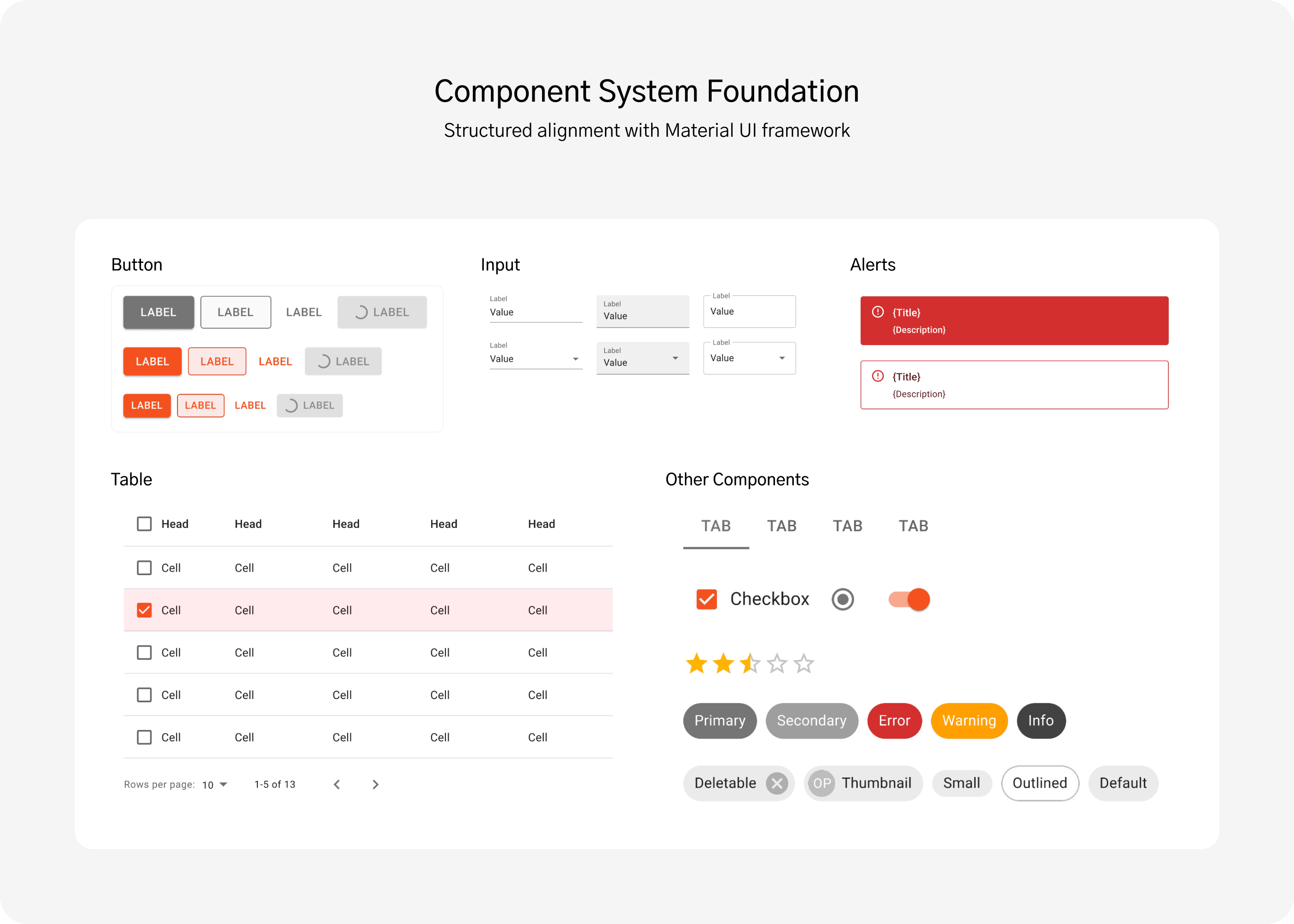
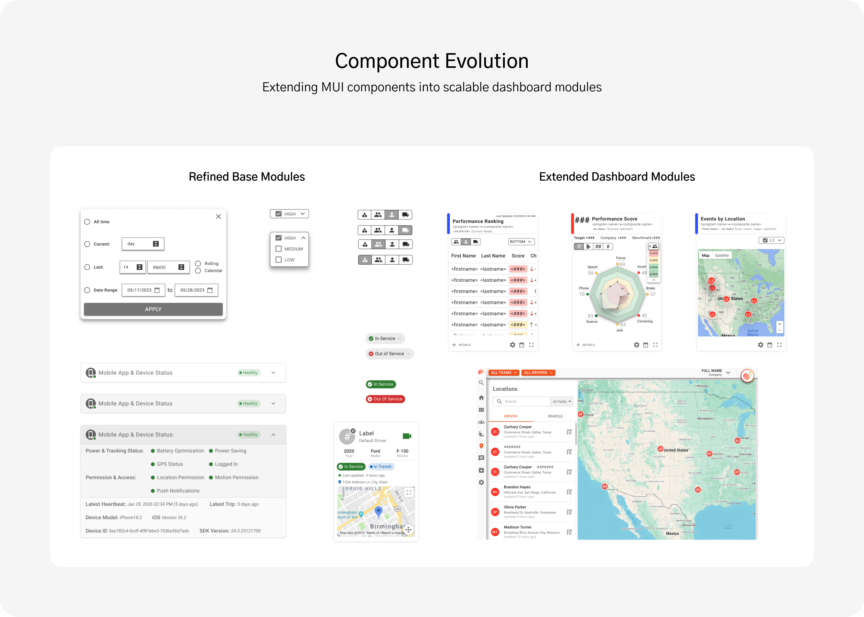
Working Within Material UI Constraints

The development team had already established Material UI (MUI) as the foundation for Tourmo’s components, ensuring consistency, accessibility, and responsive behavior across platforms. My role was to extend and refine this system while aligning it with Tourmo’s evolving visual identity and interaction patterns.

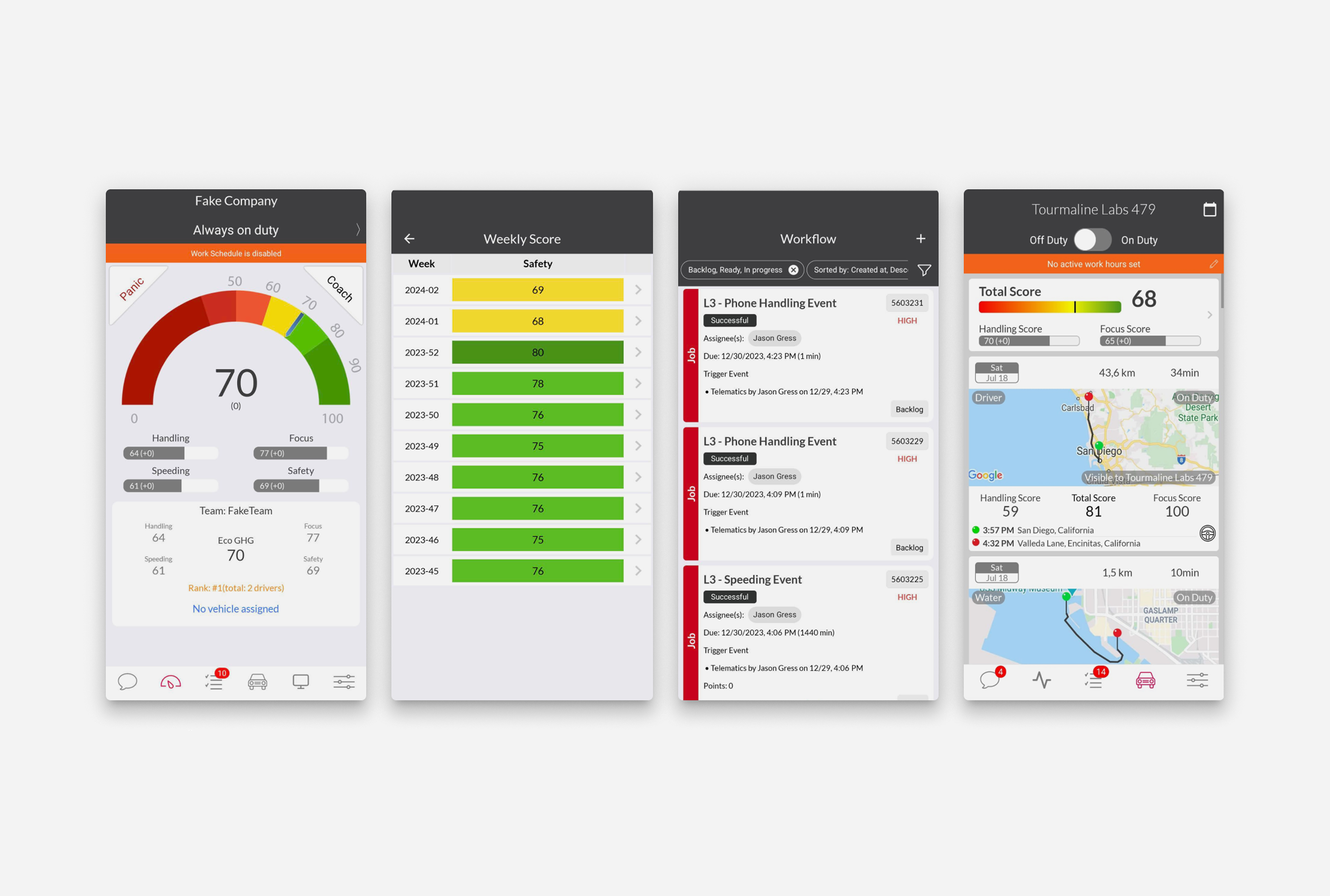
Designing Scalable Data Visualization

Representing complex operational data visually was one of the most challenging aspects of the redesign. Adapting the chart library introduced technical constraints that limited flexibility and interactivity, requiring thoughtful trade-offs.

Building a Modular Foundation

These constraints shaped key design decisions, helping define a modular structure that prioritized clarity and ensured scalability across both Web and Mobile experiences.

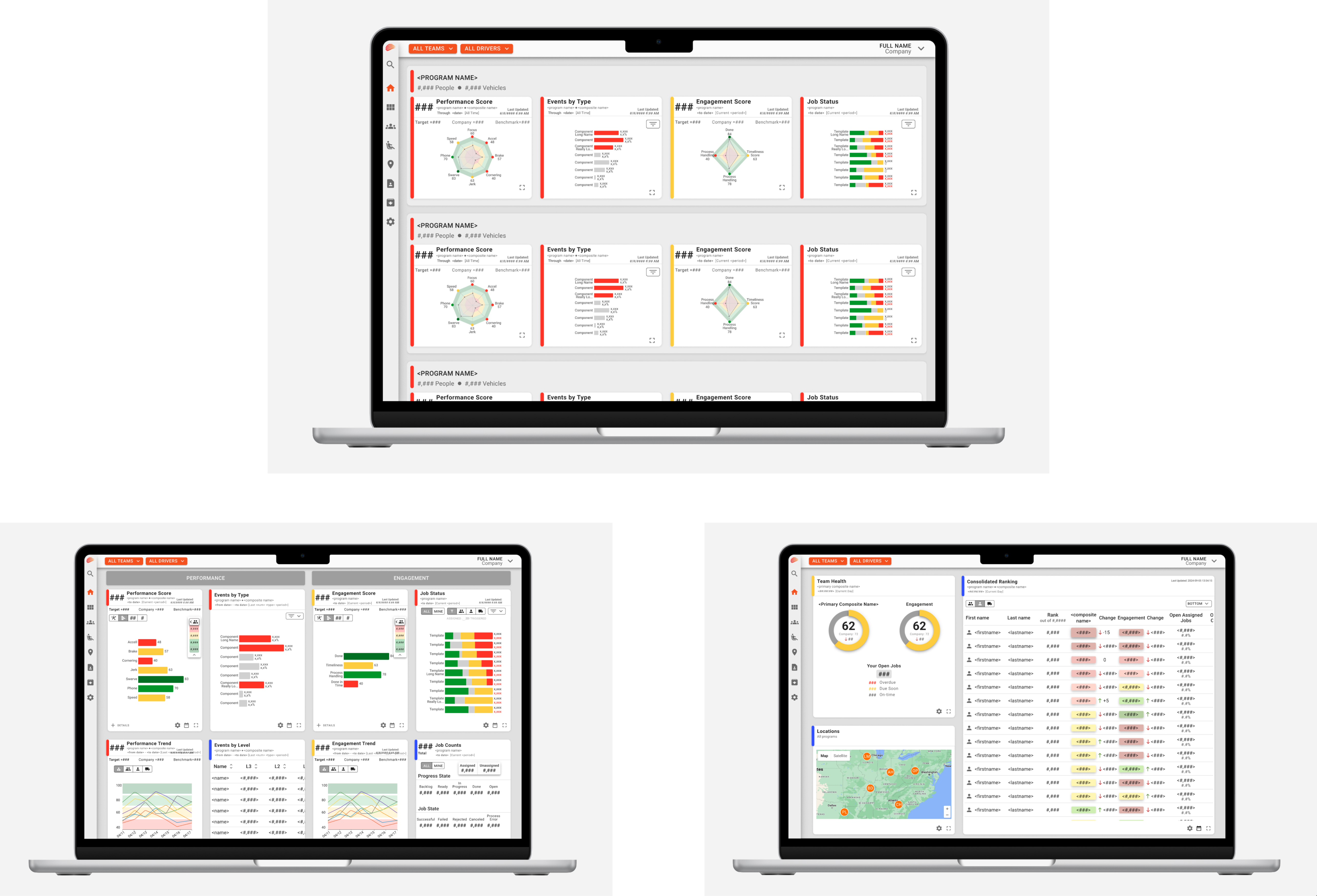
Designing a Modular and Actionable Dashboard

ideate

Transforming requirements into a flexible, data-driven interface

The ideation phase focused on translating stakeholder requirements into a flexible, data-driven dashboard system.

Collaborative Alignment

The project began with a kickoff session with the Head of Product and CTO to define scope and expectations for a centralized dashboard.

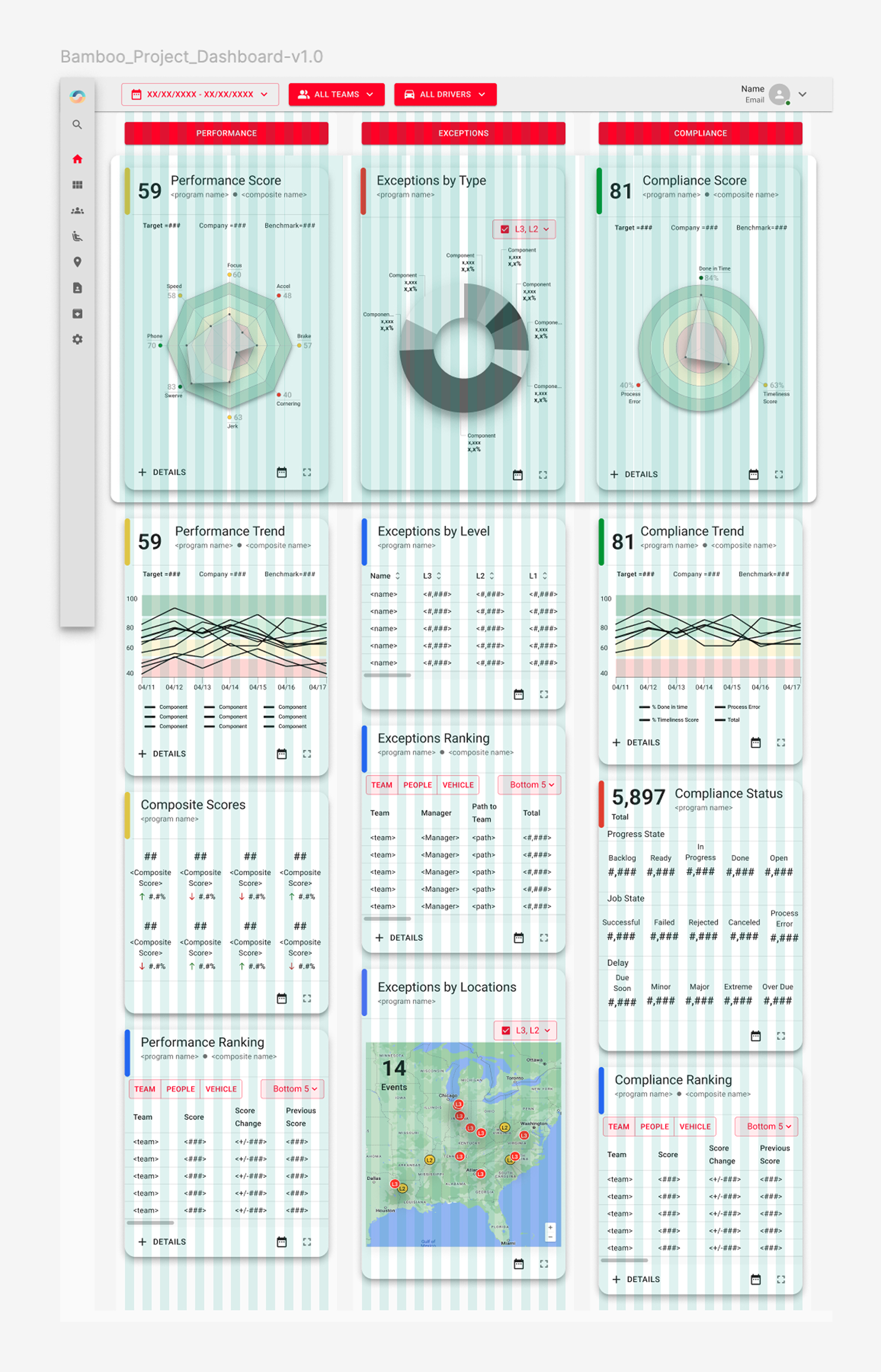
From Concept to Modular System

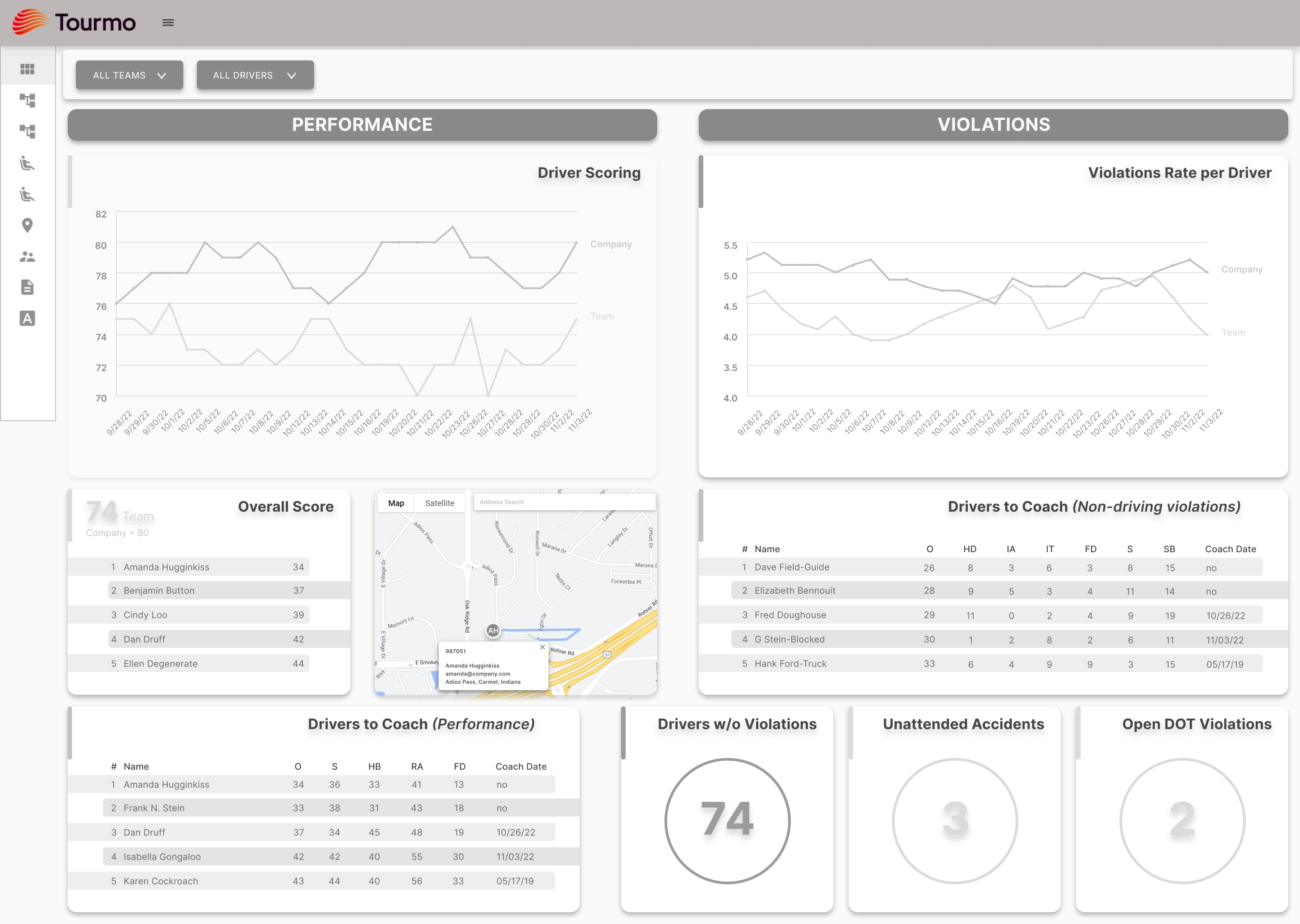
The initial structure included three columns: Performance, Violations, and Compliance. Through iteration, this evolved into a four-column layout: Performance, Events, Engagement, and Jobs.

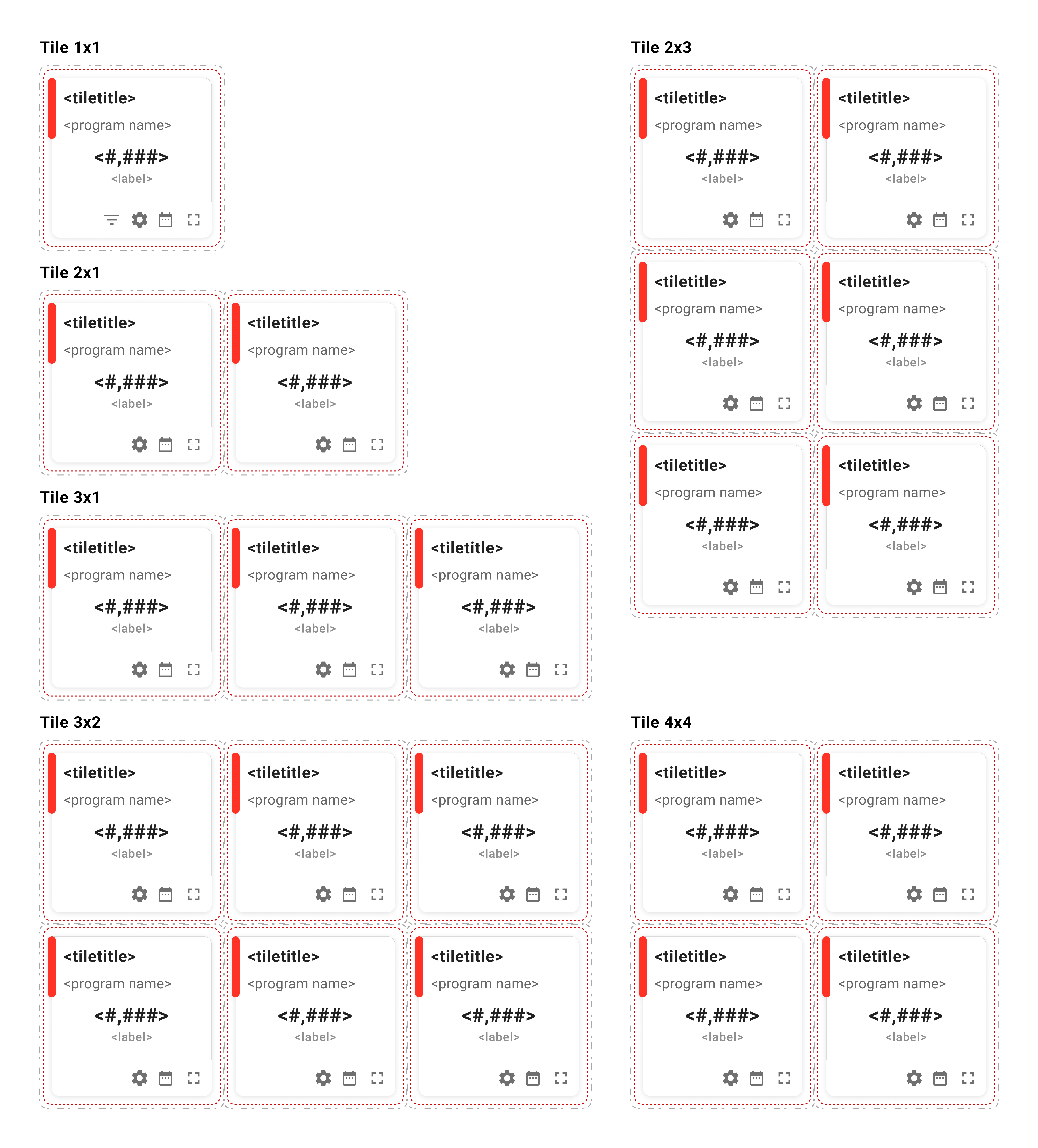
Scalable Tile Architecture

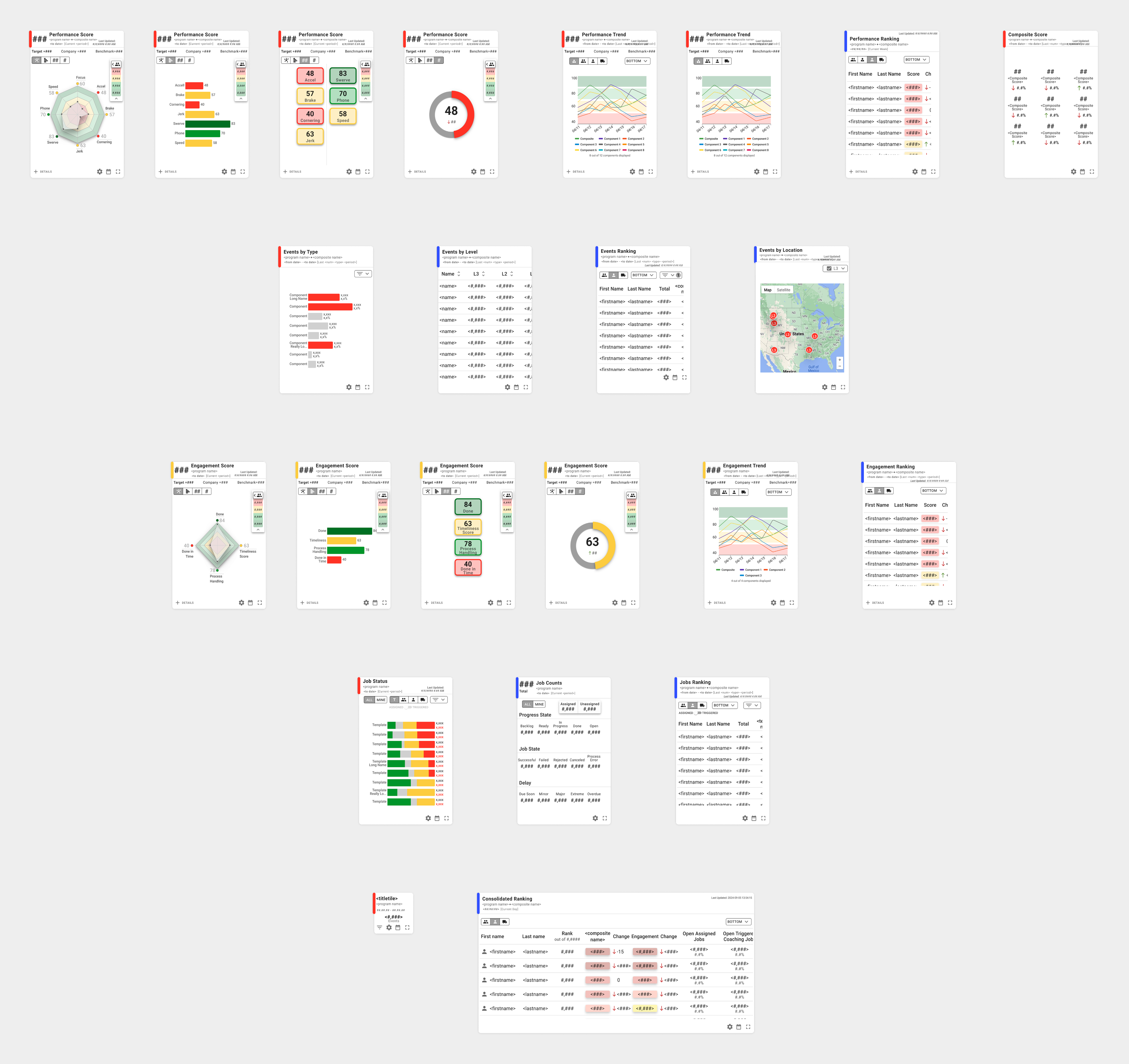
In total, the dashboard featured 18 modular tiles with flexible size and configuration options. Each tile functioned as an independent module, allowing managers to customize their workspace based on priorities.

Dashboard System Highlights

• 18 modular tiles
• Configurable layout system
• Independent data modules
• Flexible tile resizing

No items found.
Modular tile system allowing flexible configurations while maintaining hierarchy and consistency.

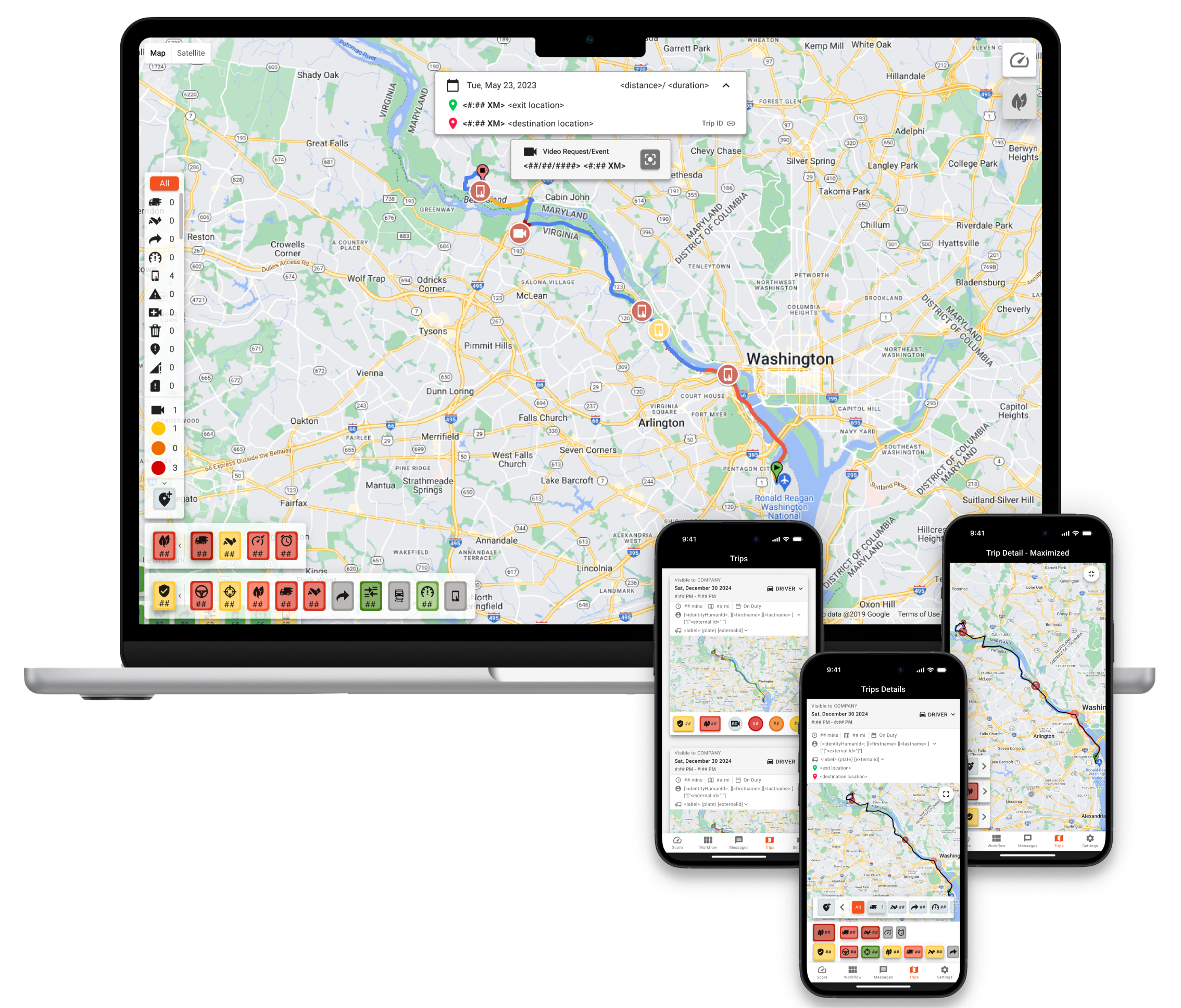
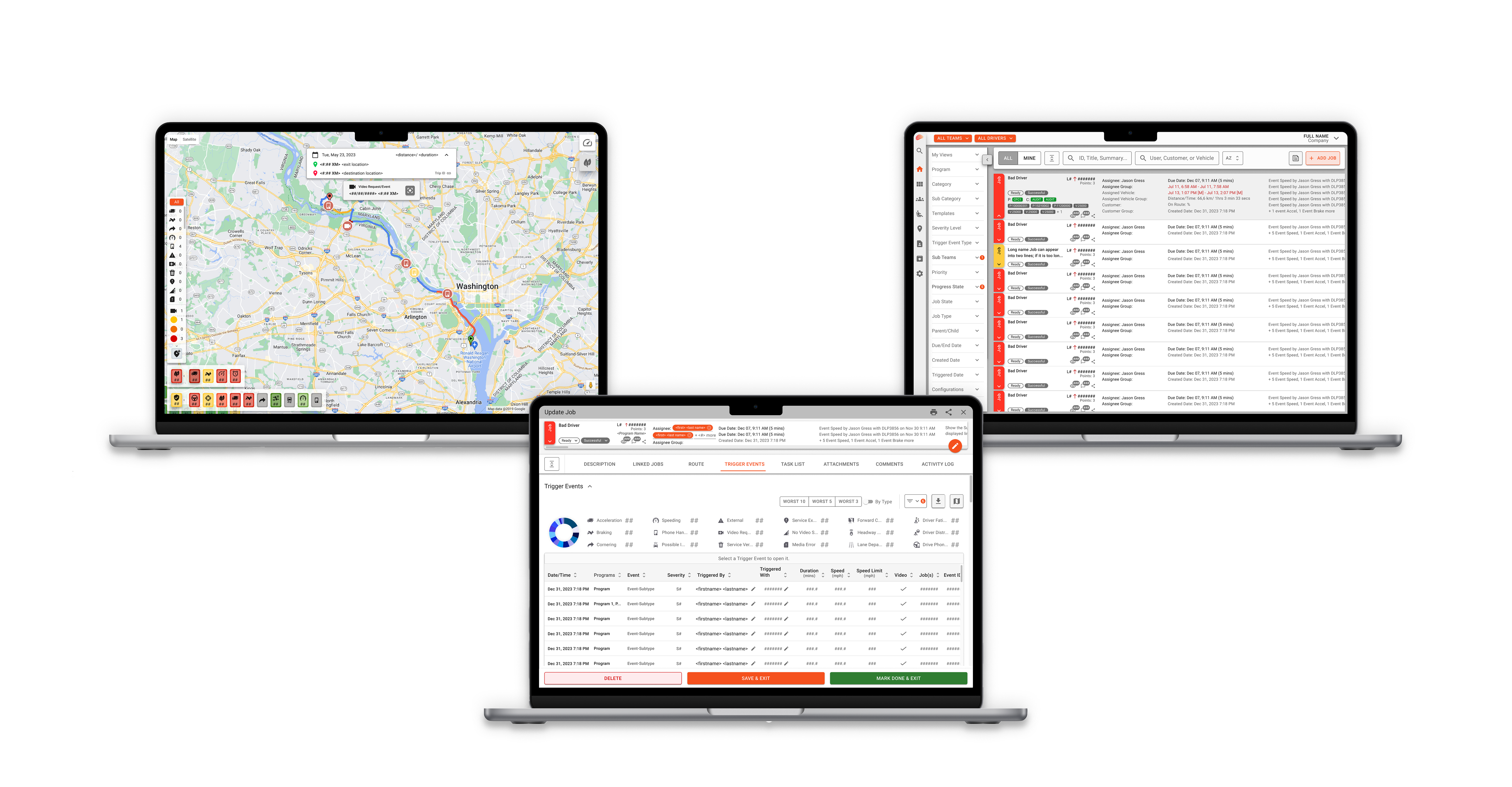
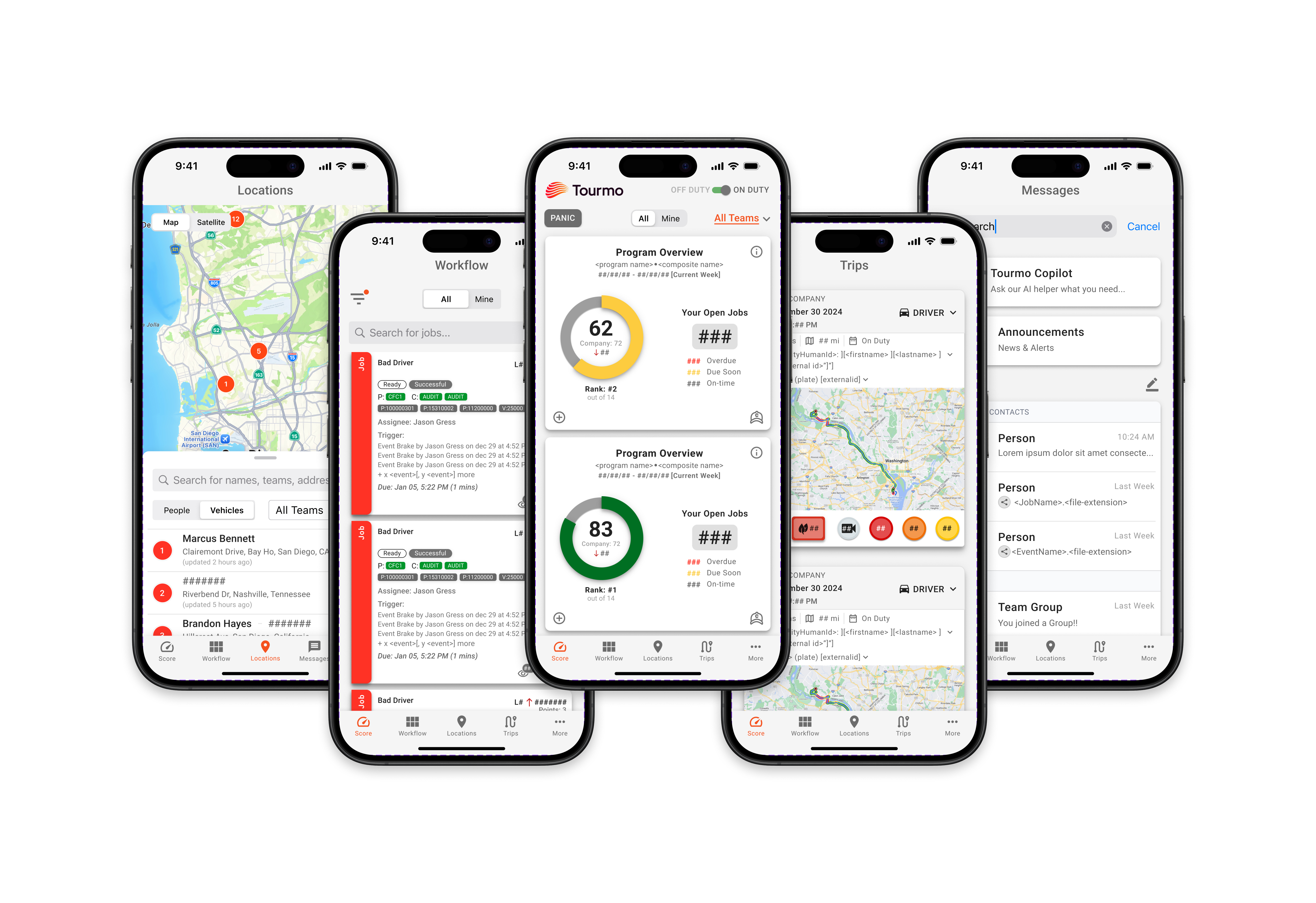
Redesigning the Web and Mobile Platforms

design

Extending clarity, consistency, and usability across Tourmo’s ecosystem

The redesigned interface prioritized hierarchy, readability, and modular consistency across devices.

Web Application

Clearer information grouping and structured data tables improved scannability and decision-making efficiency.

Mobile Application

Simplified task flows and high-contrast layouts ensured usability in field conditions.

Redesigning the WebApp for alignment and usability.Redesigning layouts and hierarchy to create a more intuitive web experience.
(click image to view larger)
More pages
Web Application
Applying a unified visual system to strengthen clarity and consistency.
(click image to view larger)
More pages
Mobile Application
Creating a cleaner, more accessible interface optimized for drivers on the move.
(click image to view larger)
More pages

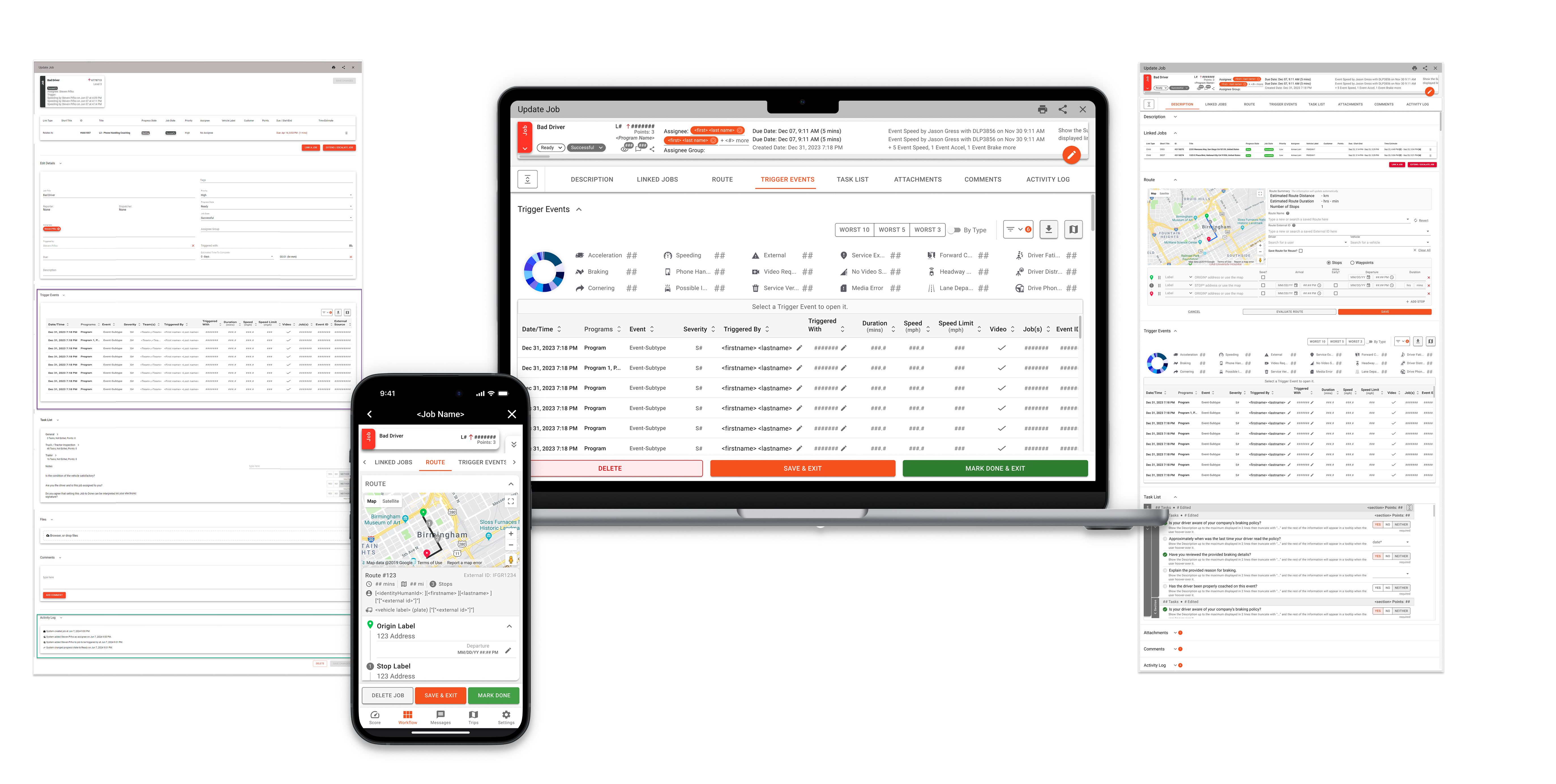
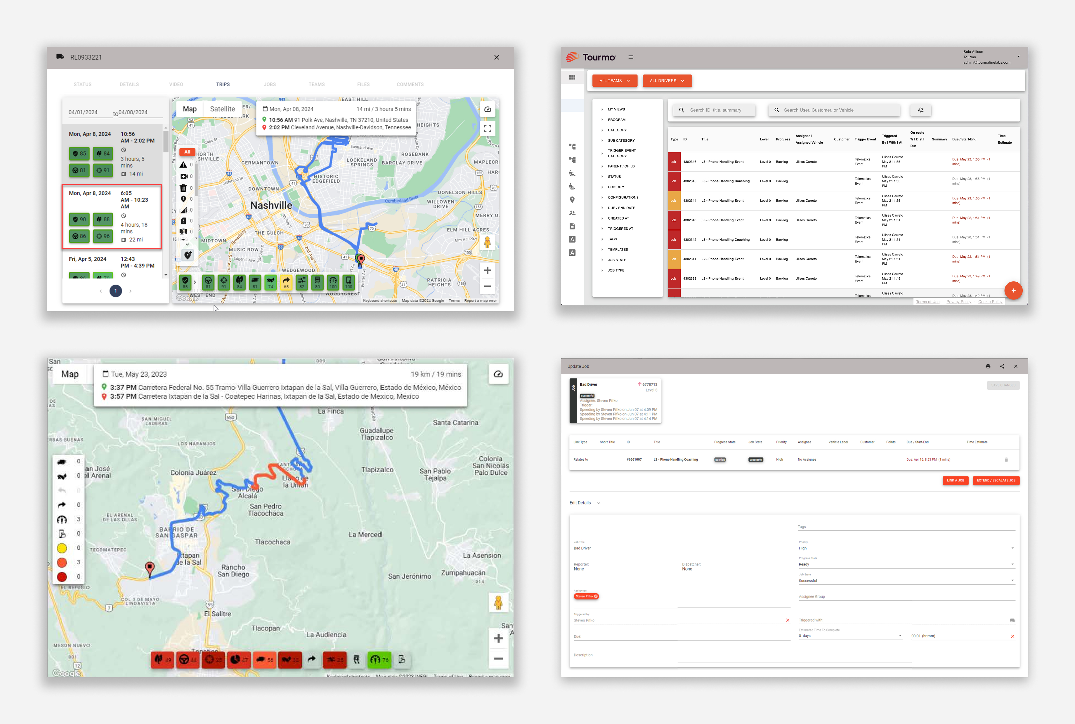
Prototyping and Implementation

prototype

Turning static designs into interactive, real-world experiences

High-fidelity prototypes were created to validate navigation, hierarchy, and usability across Web and Mobile.

Validated Through Interactive Prototyping

Interactive prototypes simulated real-world scenarios including monitoring driver performance, managing routes, and completing daily operational tasks.

Prototype Highlights

• Simulated operational task flows
• Validated dashboard hierarchy under realistic conditions
• Tested responsive behavior across desktop and mobile
• Iterative stakeholder feedback loops

Validating the Experience

Test

From Prototype to Implementation

After interactive validation, the redesigned dashboard and workflows were implemented within Tourmo’s Web and Mobile platforms. This phase confirmed alignment between design intent and technical execution.

Early internal walkthroughs helped confirm improvements in hierarchy clarity, workflow efficiency, and data readability. Collaboration with engineering ensured alignment between interaction intent and technical feasibility.

Following implementation, client feedback reinforced improvements in usability and confidence when navigating performance data.

Validation Highlights

• Stakeholder walkthroughs
• Iterative refinements
• Engineering alignment
• Post-launch feedback

Implementation Outcomes

• Successfully integrated within existing MUI framework
• Preserved modular system architecture
• Confirmed clarity improvements in real-world usage

Reflection & Lessons Learned

Redesigning Tourmo’s dashboard reinforced the importance of balancing system constraints, stakeholder priorities, and scalable interaction design.

What I Worked

• Modular system scaled successfully across Web and Mobile
• Alignment with Material UI accelerated development
• Data clarity improved operational decision-making

What I’d Improve

• Explore more advanced chart libraries to enable richer interactivity and storytelling
• Further evolve real-time visualization strategies as the product scales

The modular framework established during this redesign continues to support ongoing product updates across Web and Mobile platforms.

This project strengthened my ability to design scalable systems while balancing technical feasibility and user-centered clarity.