Fashion E-Commerce Responsive Website
Understanding the Challenge
The challenge was to design an e-commerce platform that would resonate with modern fashion shoppers. Beyond just aesthetics, the website needed to address common pain points such as sizing concerns, trust in product quality, and the ease of finding and purchasing items. My goal was to create a responsive experience that combined clarity, convenience, and visual appeal while also meeting business priorities around conversion and retention.
Role
Product Designer (UI/UX)
deliverables
Research, Flows,
Wireframes & Prototype
plataforms
Desktop & Mobile
tools
Figma, Miro, Zoom, OptimalSort, Google
Overview
A complete UX and UI project focused on shaping a seamless shopping journey for fashion consumers. From research and strategy to wireframes and a working prototype, this project demonstrates how a human-centered design process can define structure, flows, and interfaces that align user needs with business goals.
Research & Insights
discover
Methods Used
Competitor research, empathy mapping, persona creation, affinity mapping, card sorting, and design pattern analysis.
Key Findings
• Trust matters: Shoppers need clear product details, transparent sizing, and reliable imagery.
• Navigation must be simple: Confusing structures increase drop-off rates.
• Convenience drives loyalty: Fast paths to deals, wishlists, and checkout encourage return customers.
• Emotional connection counts: Users respond positively to experiences that feel personal and stylish.
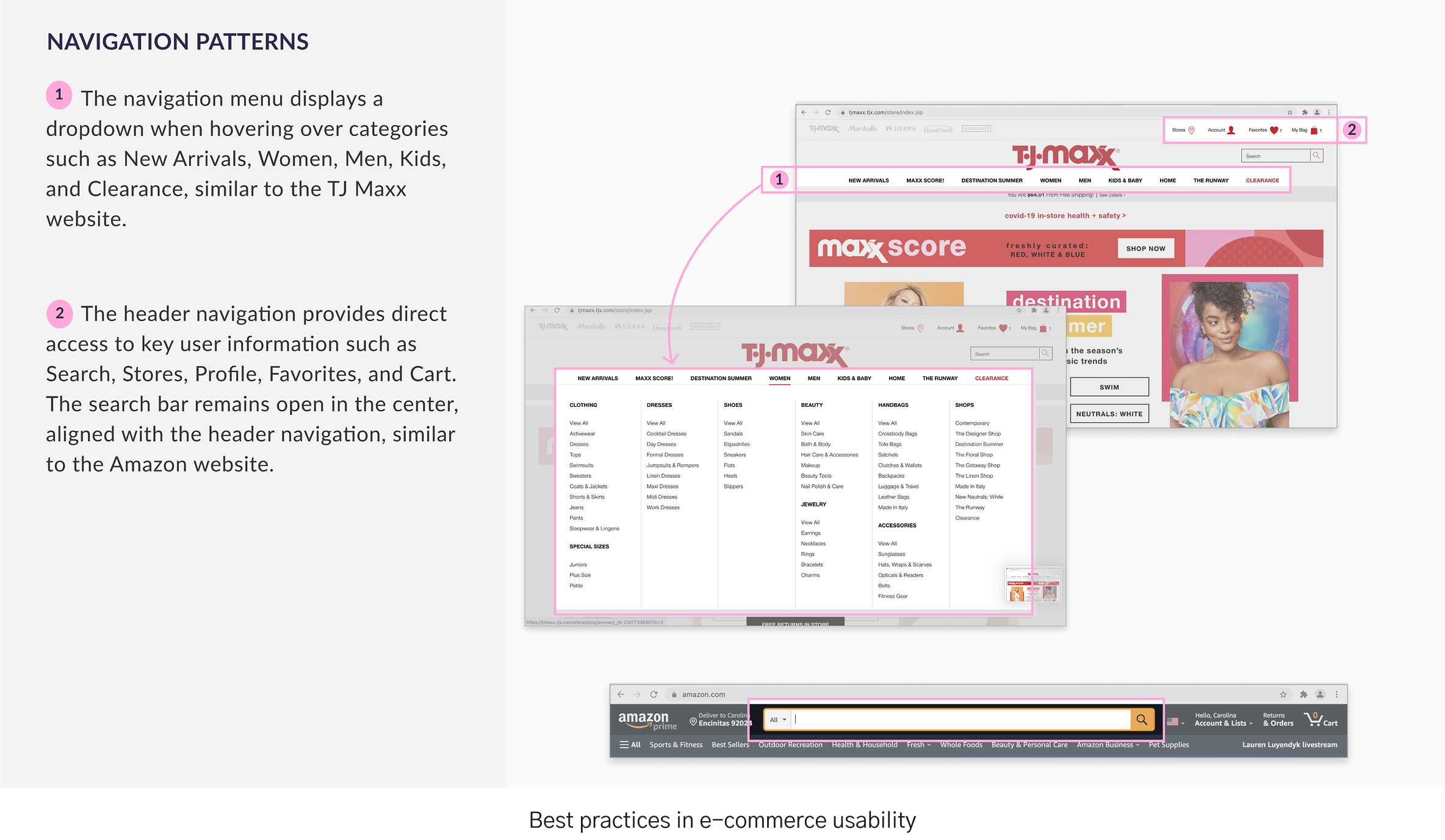
Competitor Research, Design Patterns & Affinity Map
We began by analyzing the competitive landscape and reviewing established design patterns in fashion e-commerce. This helped uncover both best practices and gaps where MOVA could differentiate. To consolidate findings, we created an affinity map that clustered recurring themes and insights, guiding early design decisions with a clear understanding of user expectations and industry standards.

No items found.
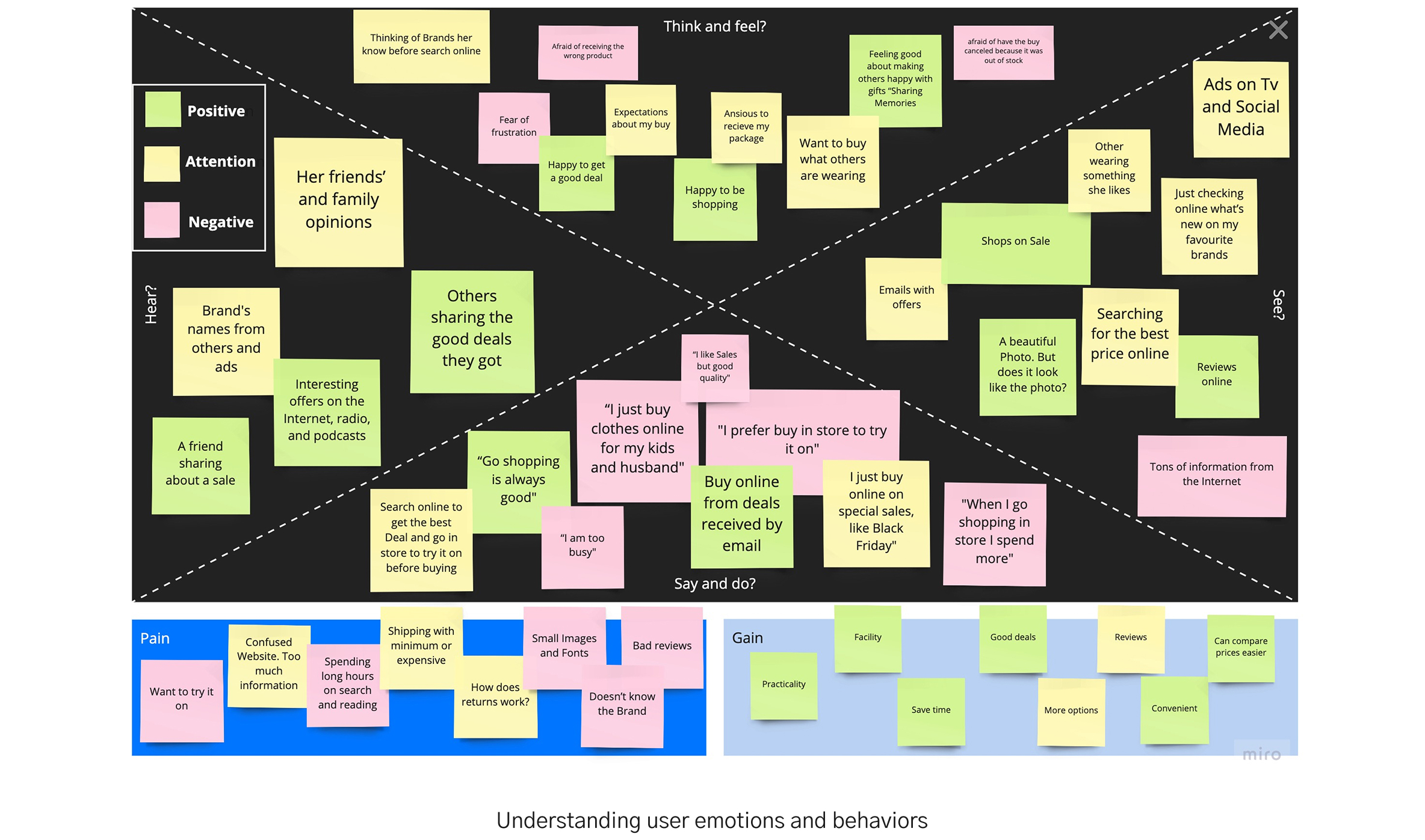
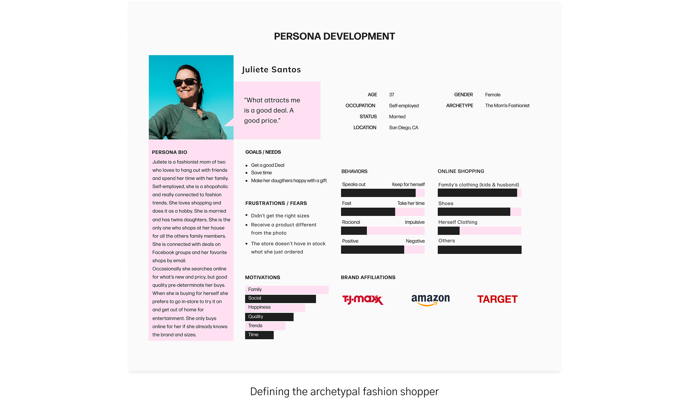
Empathy Map & Persona
To better understand the target audience, we developed empathy maps capturing user frustrations, motivations, and behaviors. From these insights, we created a detailed persona representing the archetypal fashion shopper. This persona kept the design process anchored in real user needs—such as trust in product quality, sizing confidence, and the desire for effortless navigation.
No items found.
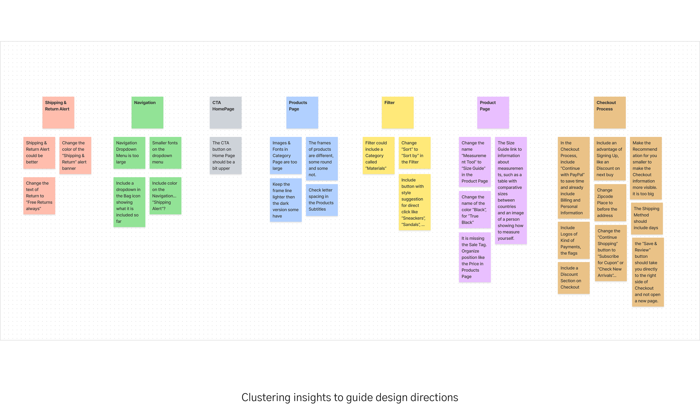
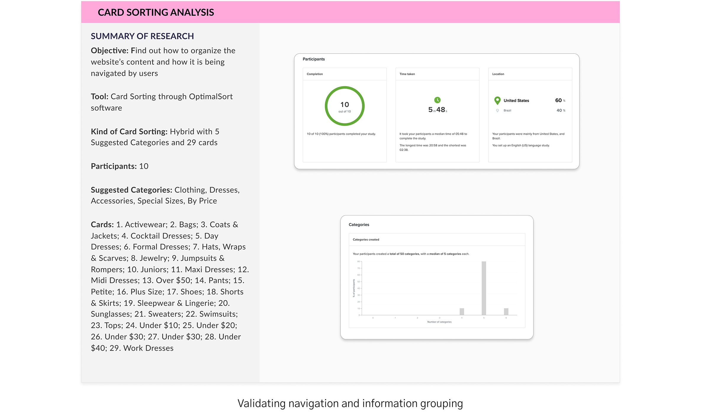
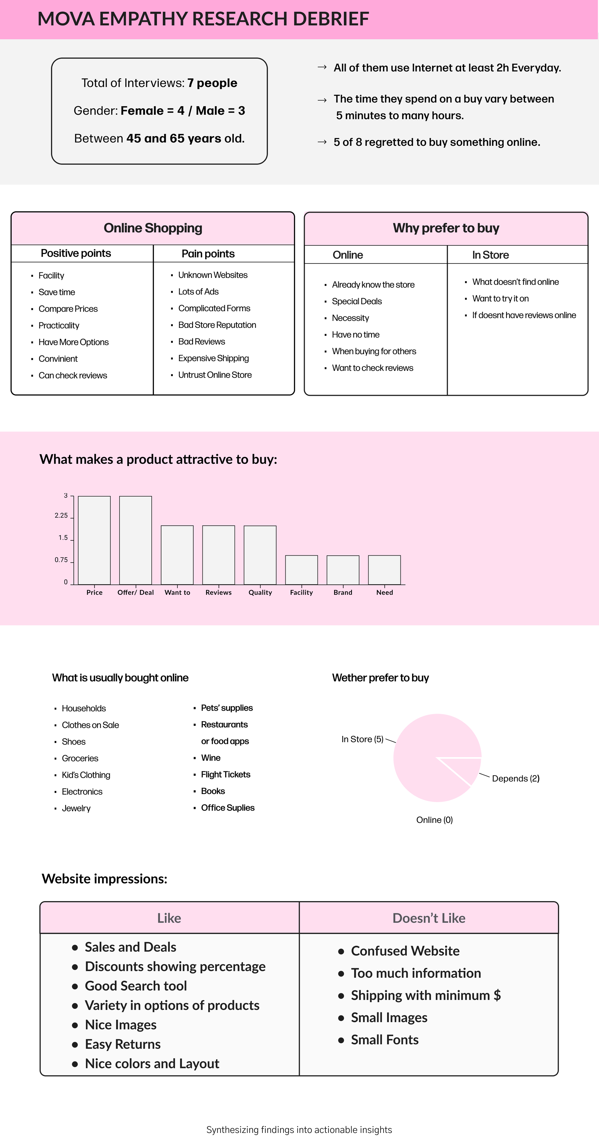
Card Sorting & Research Debrief
To validate the site structure, we conducted card sorting exercises that clarified how users naturally group and label information. This directly informed the sitemap and navigation design. We concluded the research phase with a debrief that synthesized all key findings into actionable insights, ensuring alignment between user needs, business goals, and the upcoming design phase.
No items found.
Strategy & Structure
define
From insights to actionable foundations
We translated research findings into a clear strategy and foundation for the e-commerce experience. By aligning user needs with business objectives, we defined key goals and created a sitemap that guided the navigation and layout of the platform. A Feature Roadmap was also developed to prioritize must-have functionalities versus differentiators, ensuring the project was both user-focused and business-aligned.
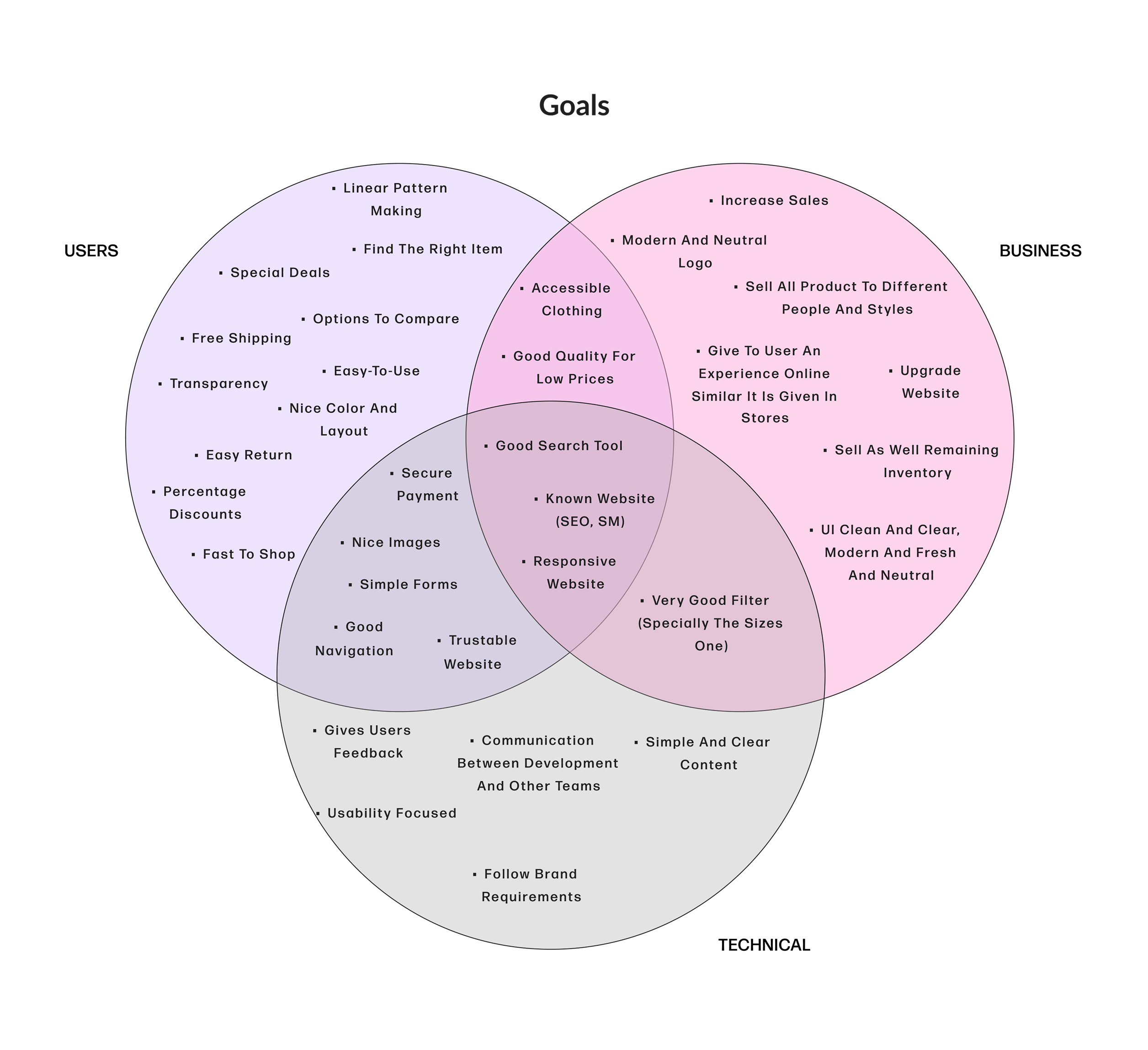
Balancing user needs with business objectives
(click image to view larger)
More pages
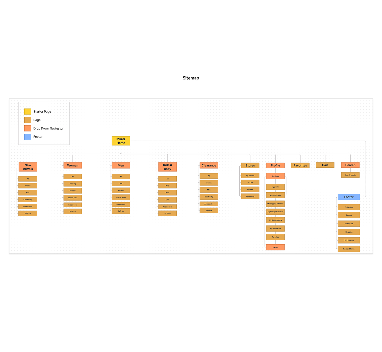
Defining the information architecture for navigation
(click image to view larger)
More pages
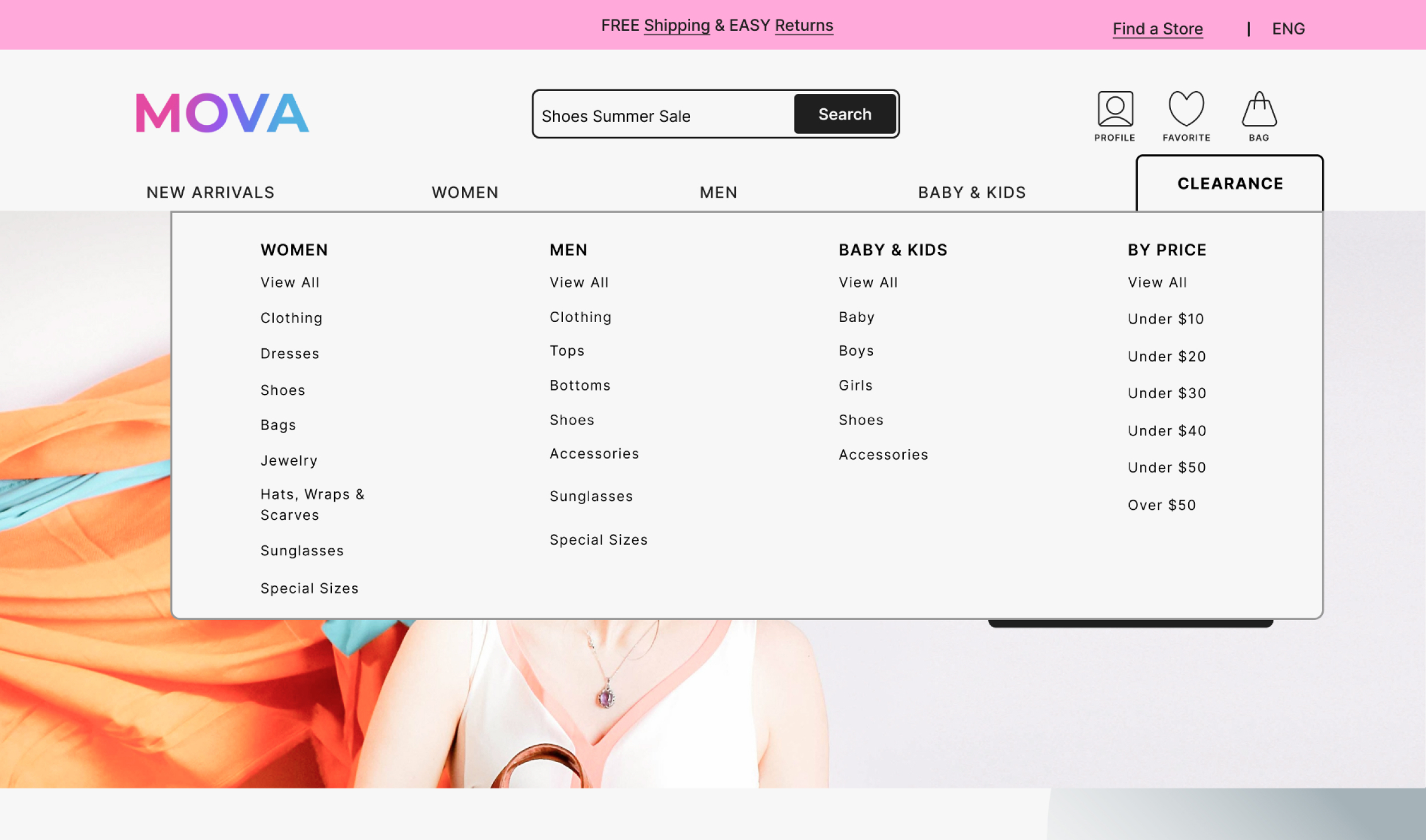
Wireframes & Iteration
ideate
Exploring structure through responsive layouts
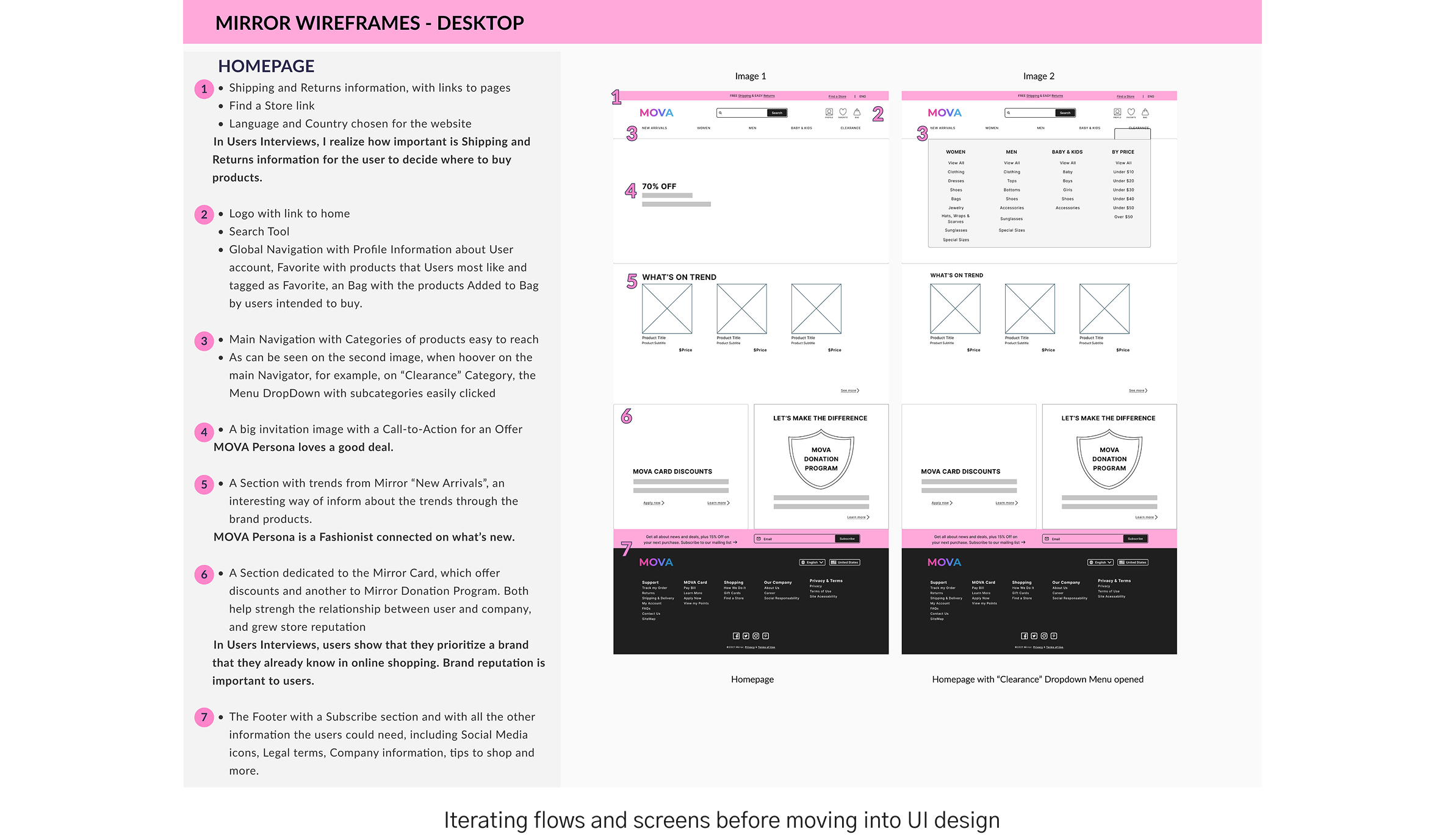
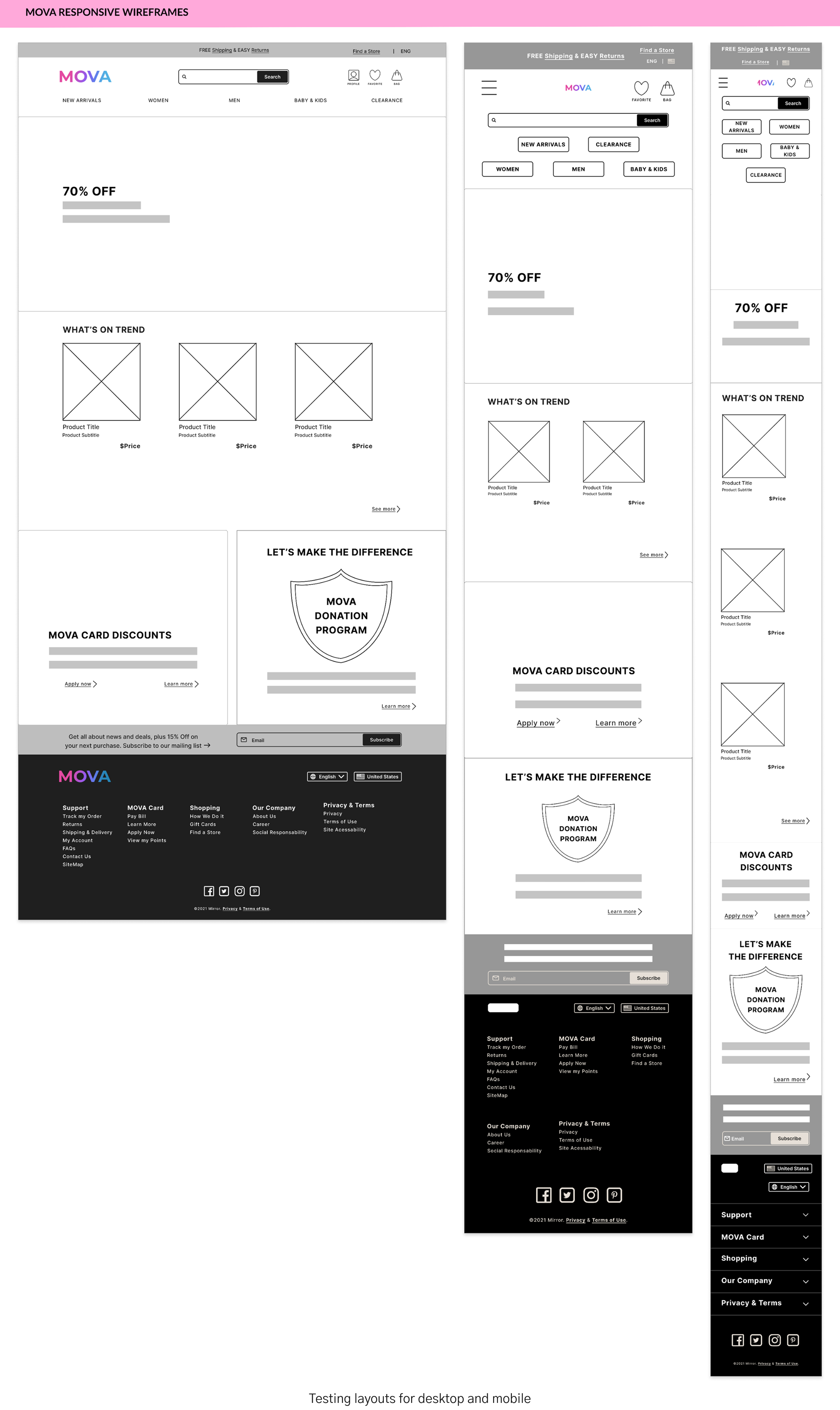
We moved from strategy to early design by creating wireframes that tested navigation, hierarchy, and content placement across desktop and mobile. These low-fidelity explorations allowed us to validate key flows before investing in visual design, ensuring the structure supported user needs in an intuitive way.
No items found.
UI Design System
design
Establishing consistency and visual identity
Building on the foundations from research and wireframes, we developed a visual system to ensure clarity, consistency, and usability across the e-commerce platform. The system combined typography, color, and imagery with reusable components, creating a modern and cohesive design language that supported both brand differentiation and user trust.
Exploring directions for a modern fashion identity
(click image to view larger)
More pages
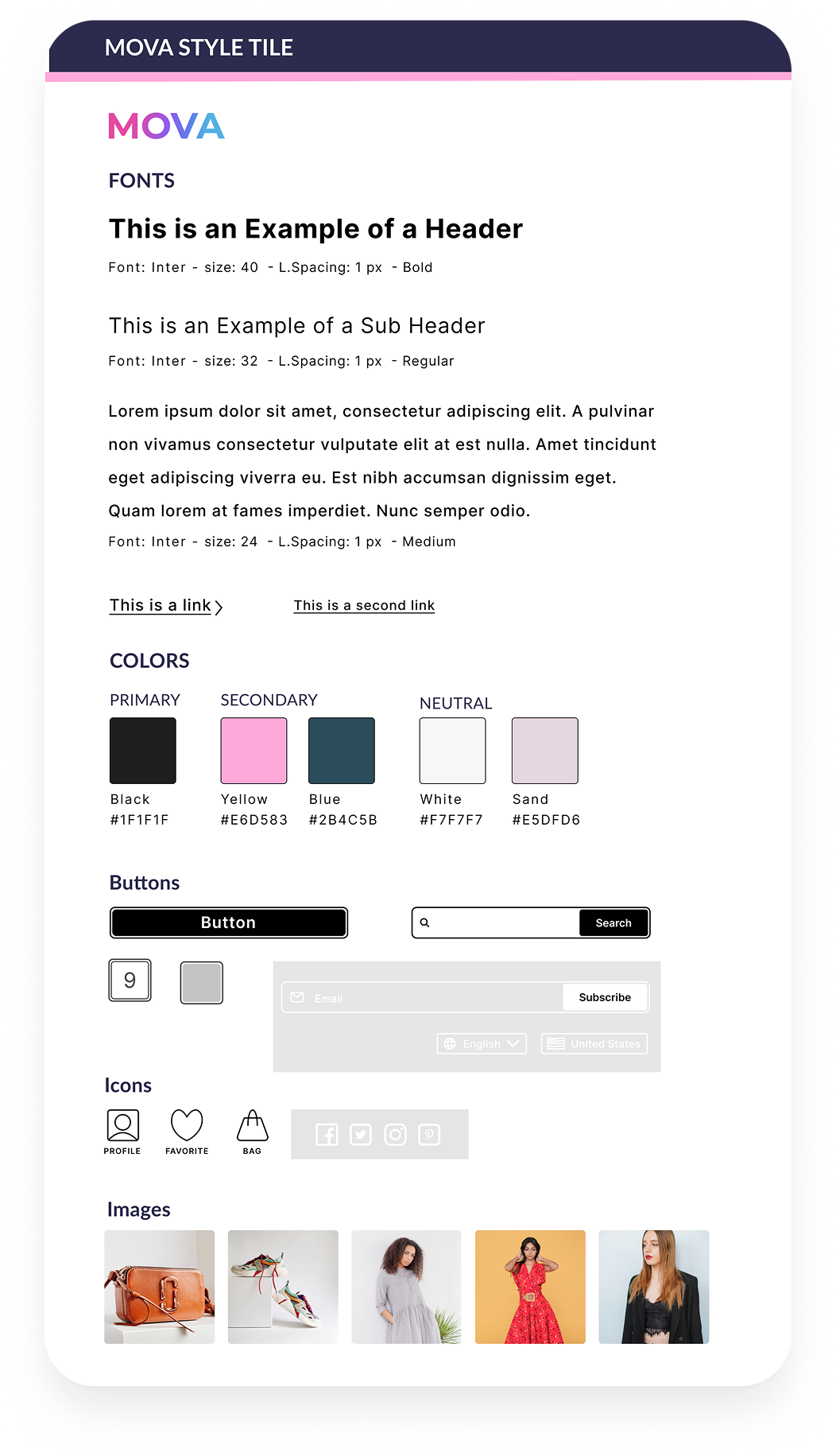
Defining color palette, typography, and imagery
(click image to view larger)
More pages
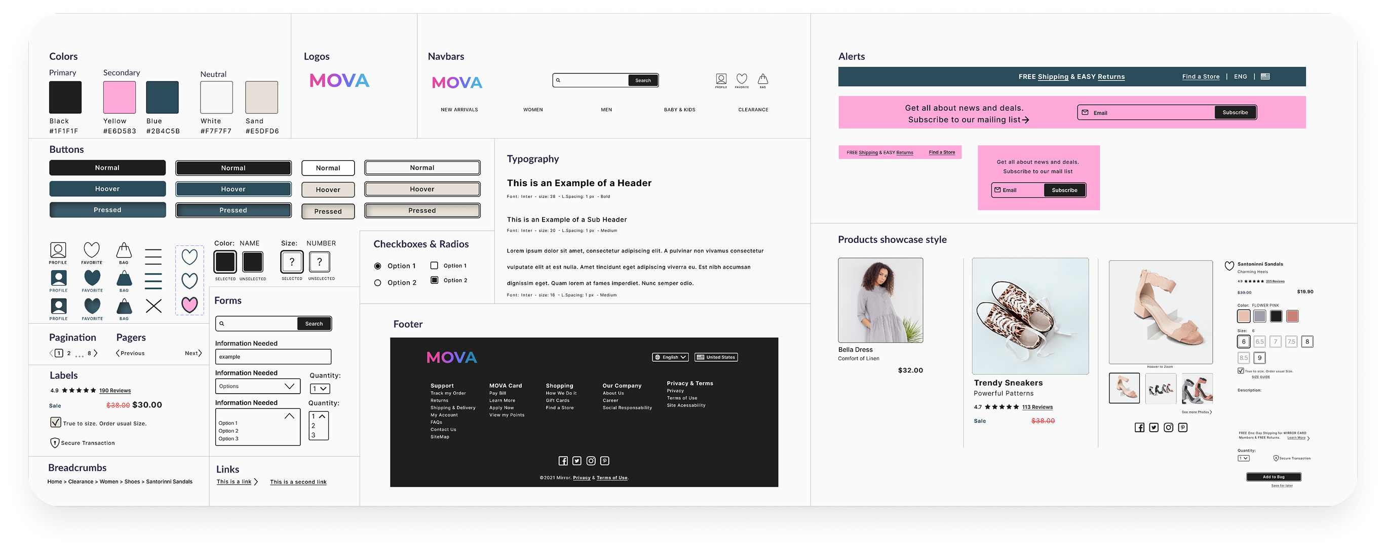
Reusable components and patterns for scalability
(click image to view larger)
More pages
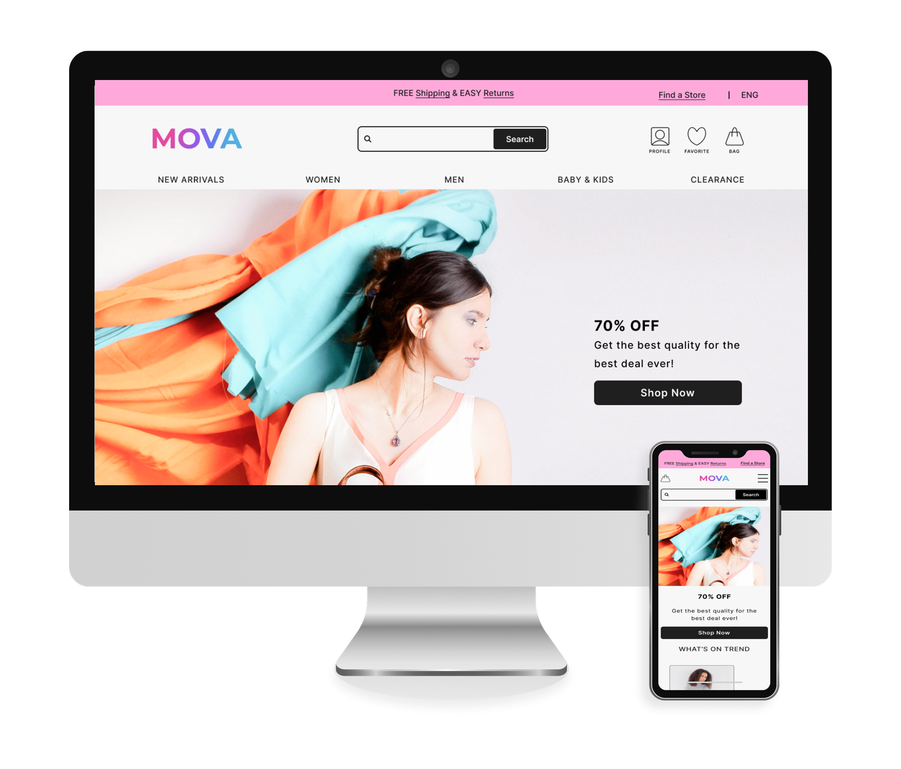
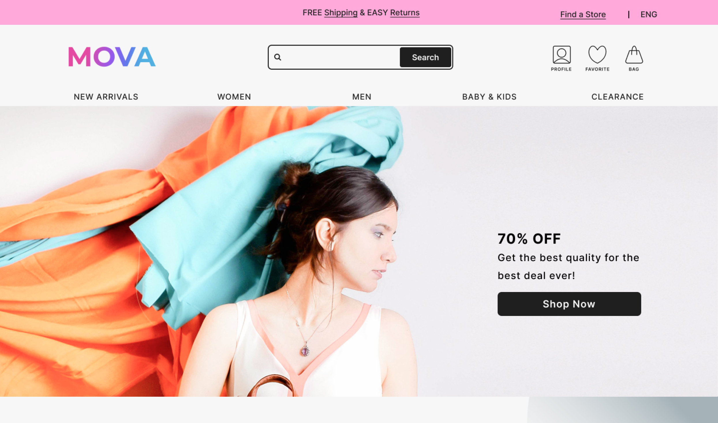
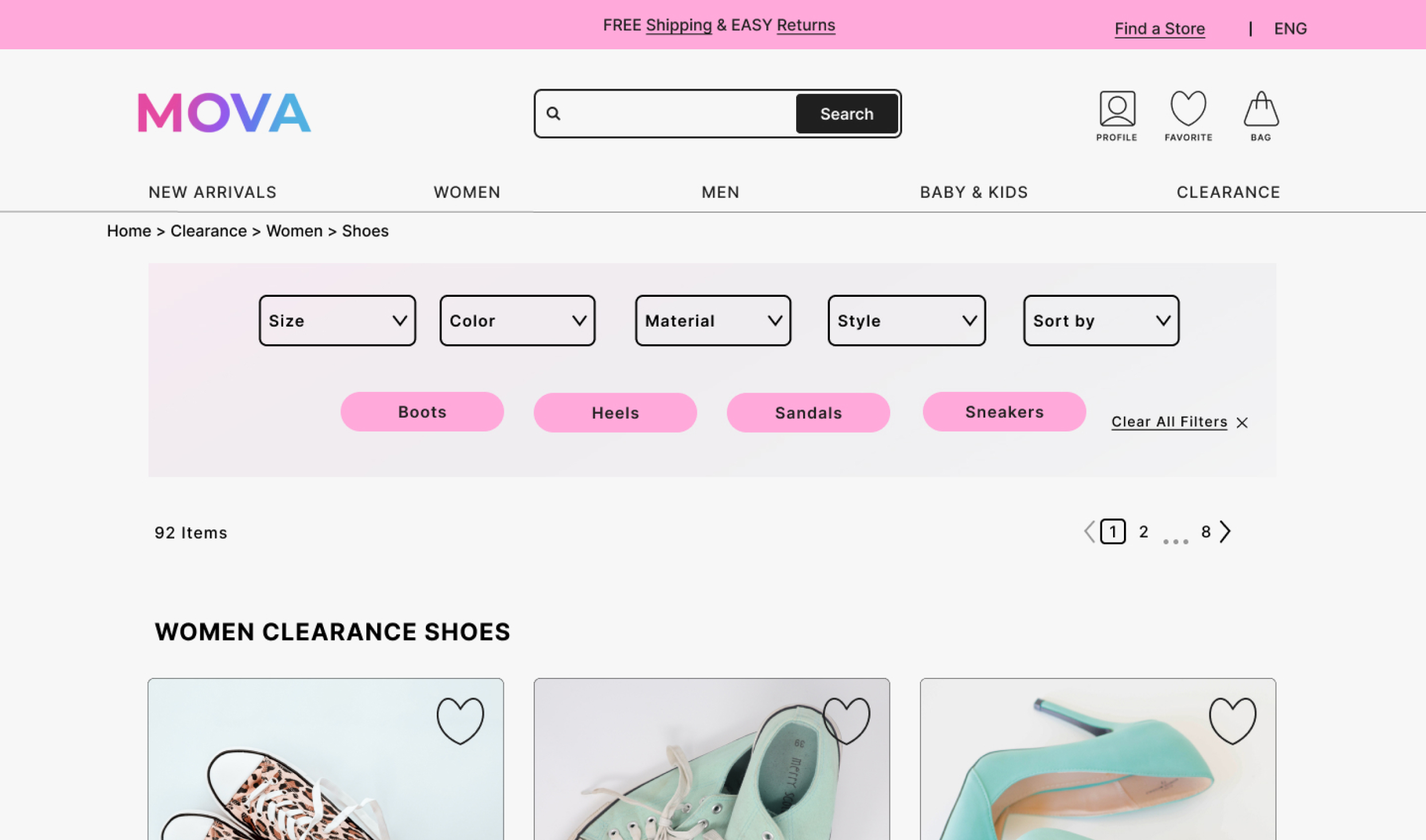
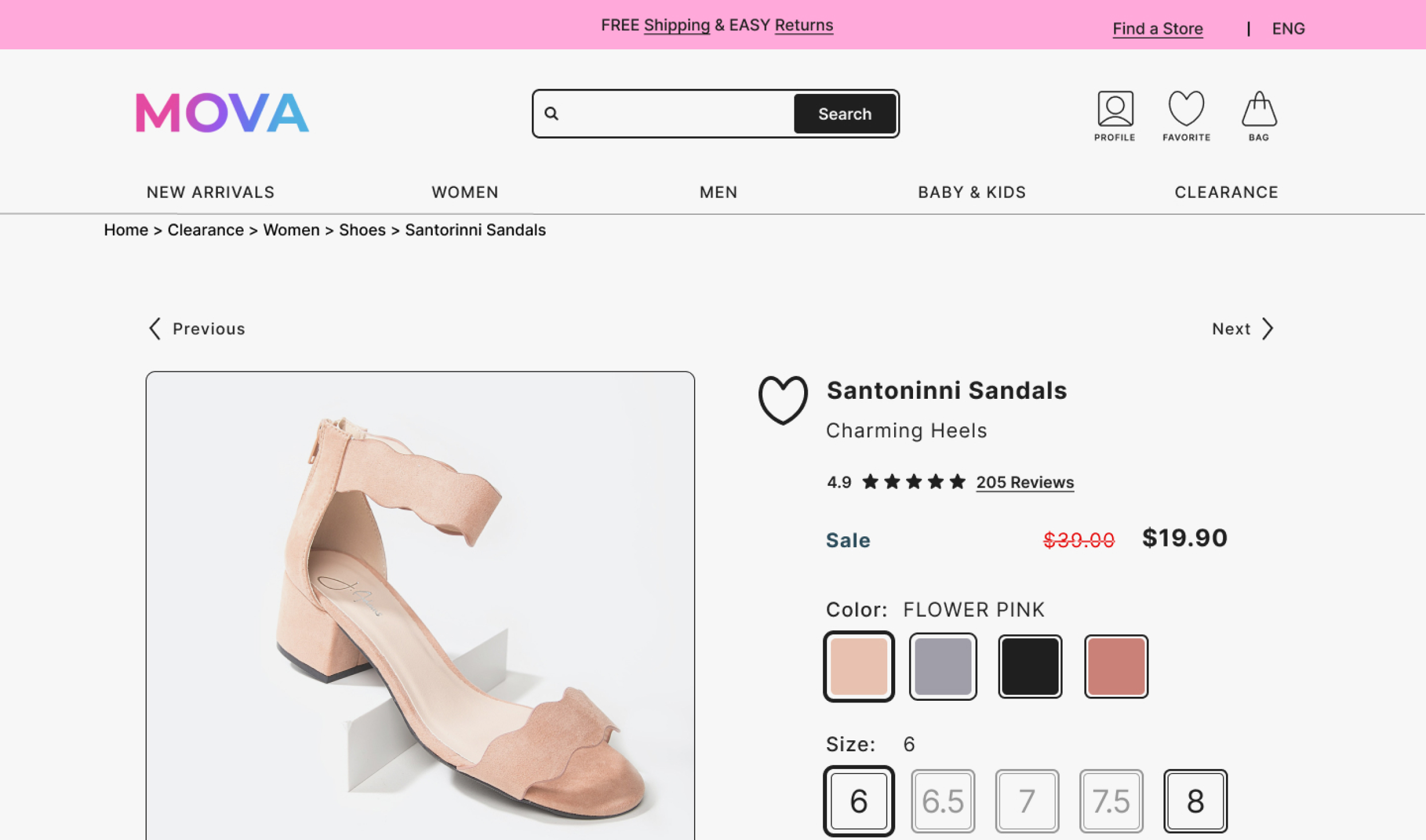
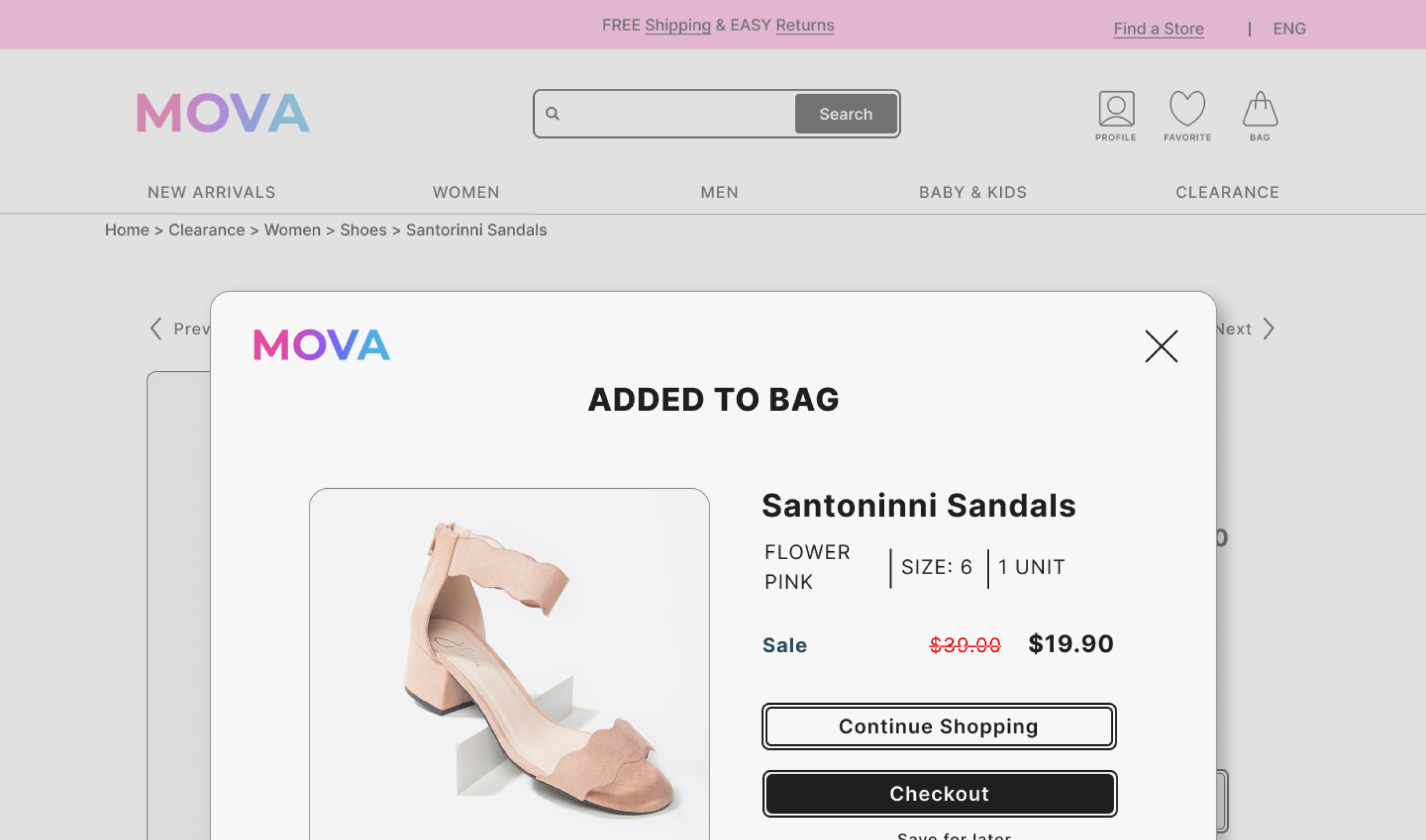
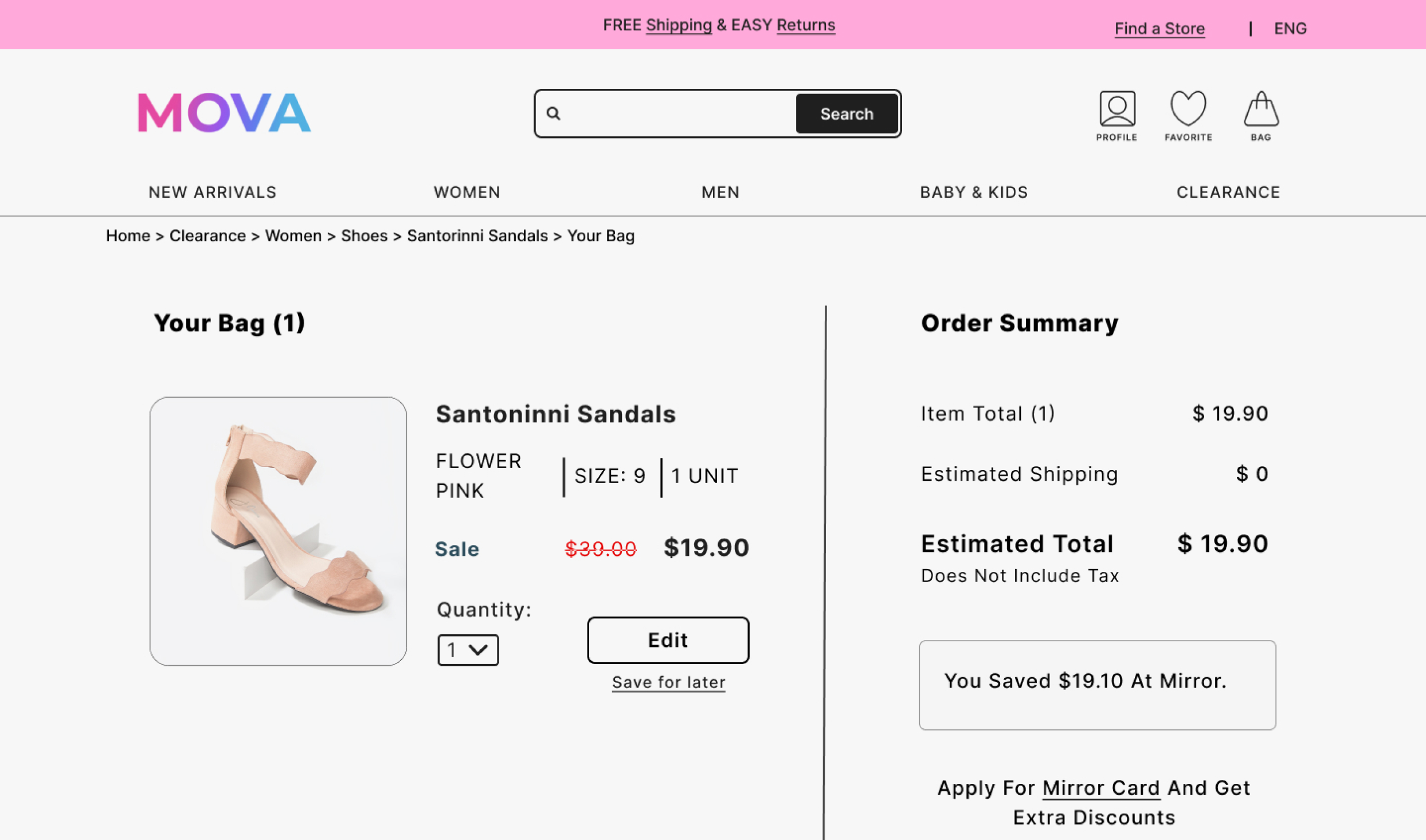
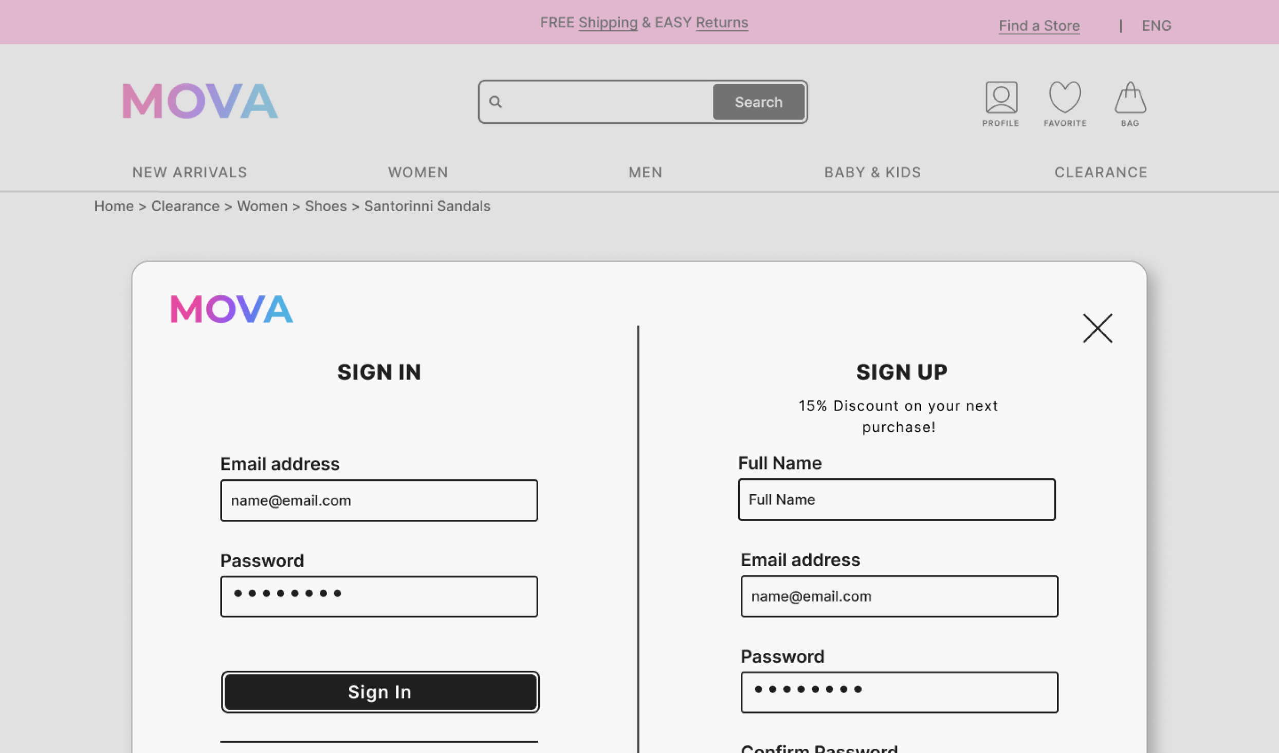
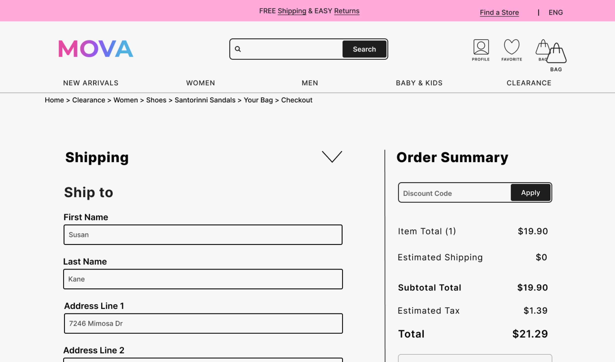
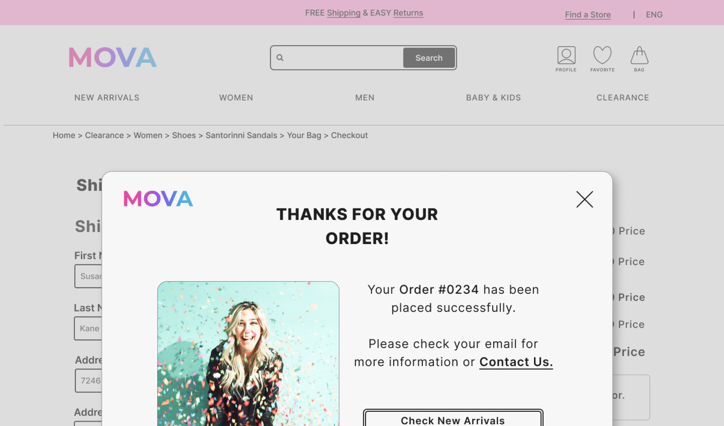
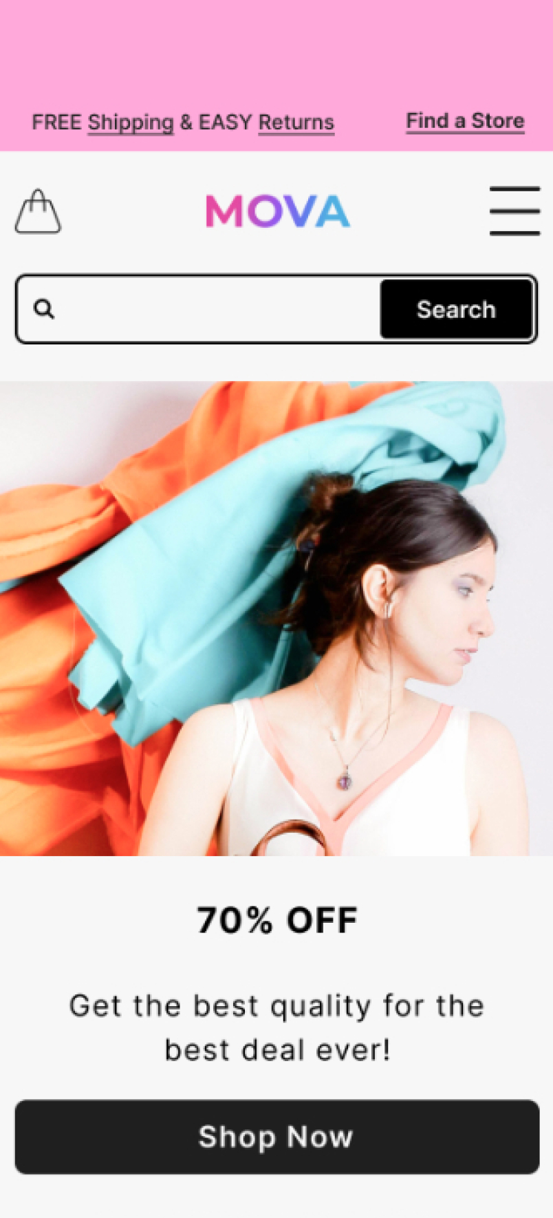
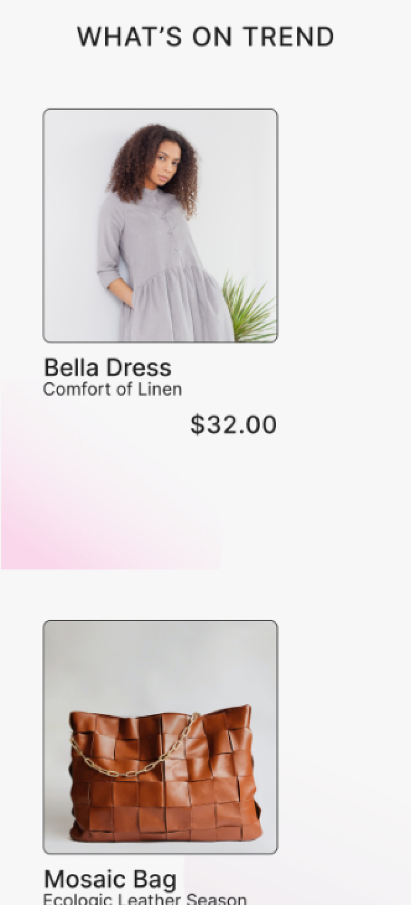
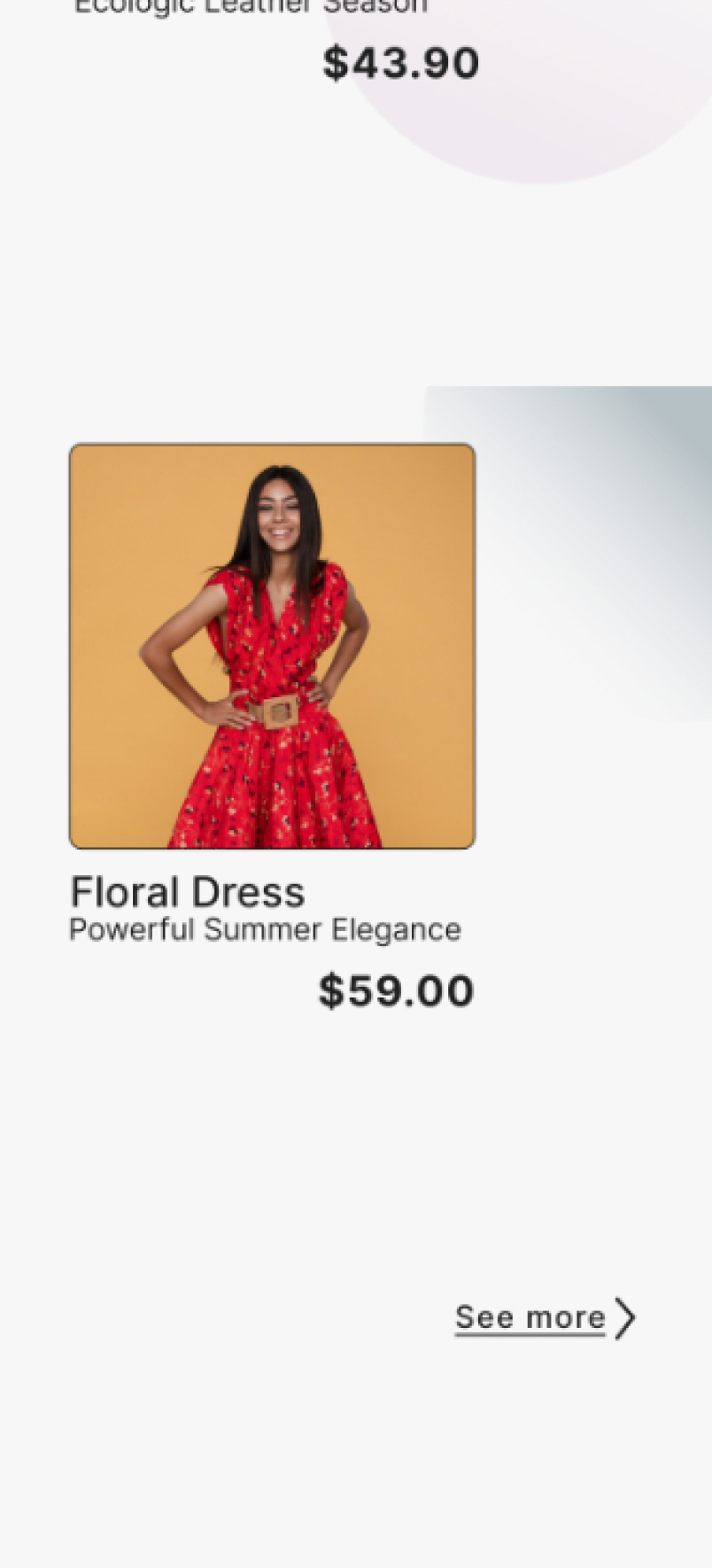
Final Prototype
prototype
Bringing the experience to life
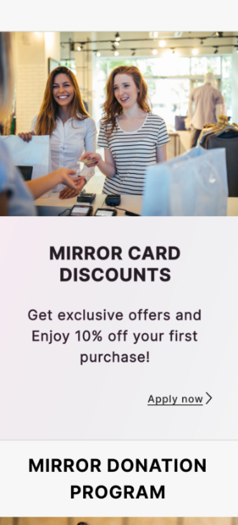
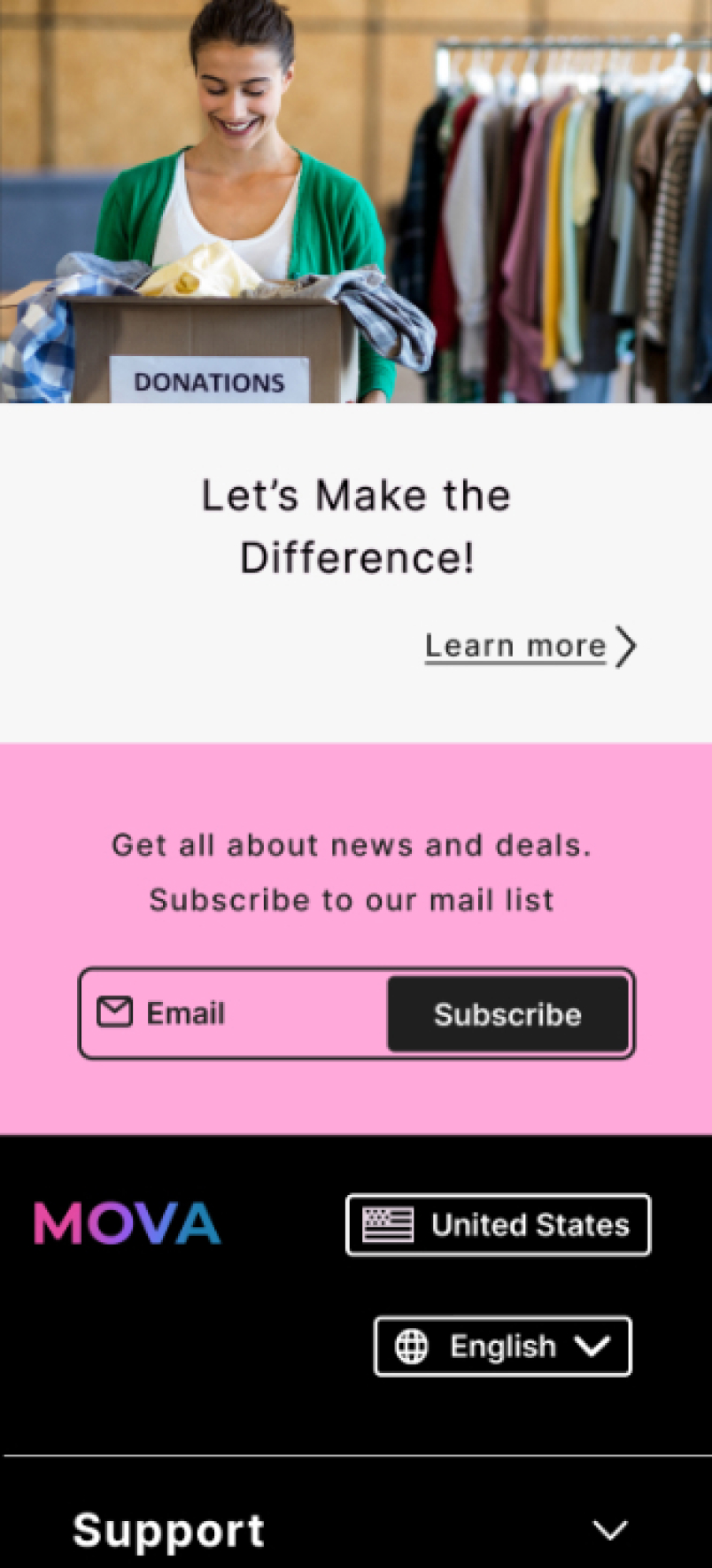
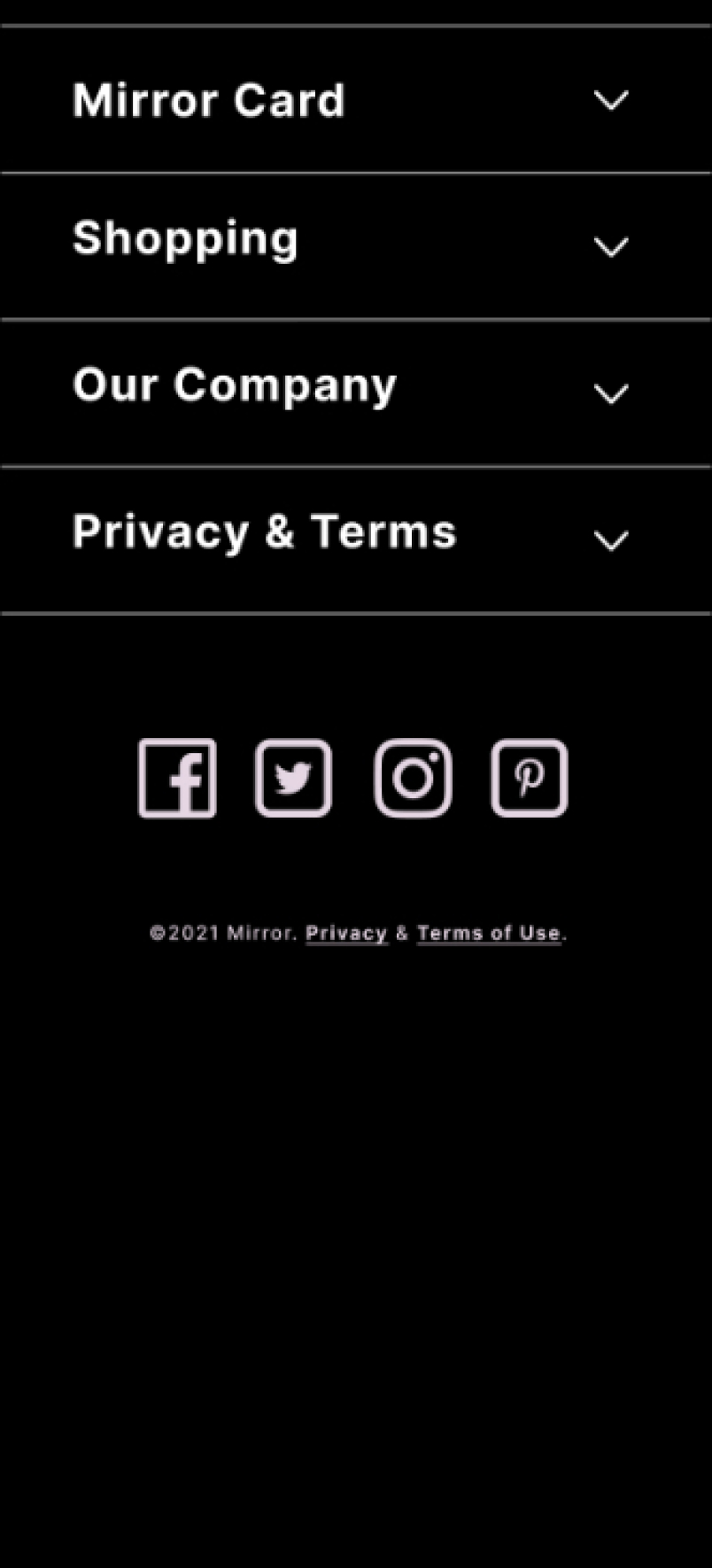
The final prototype translated research insights, structure, and the UI system into an interactive e-commerce experience. Users can browse products, explore details, and complete purchases across desktop and mobile with clarity and ease. This prototype demonstrates how consistent design decisions support user trust, efficient navigation, and business goals such as conversion and retention.
No items found.
No items found.
Reflection & Lessons Learned
This project reinforced the importance of starting with strong research. By diving into competitor analysis, empathy mapping, and personas, we built a foundation that kept every design decision user centered. Translating these insights into goals, priorities, and structure showed how strategy can guide the creative process toward clarity and alignment.